WWF - The PDF you can't print...

Well, here's a pretty bold way to advance conservation: a PDF-like file format that can't be printed. WWF files (named for the World Wildlife Fund in a clever bit of branding) are essentially just like PDFs except for that curious lack of a "print" option. They're meant for documents that the author knows can be used just as well without a paper copy - especially in workplaces where the inclination is to print every possible thing before a meeting. Sure, hackers will find plenty of ways around this restriction, but that's not the point. Adding this little barrier, even if it can be overridden, will prevent a huge percentage of those documents from ever being printed - they'll stay digital, and stay green. Nice!

Tie Tea Cup

I love it when a product's function and design doesn't even need to be explained. The Tie Tea Cup, by George Lee.

[via SwissMiss]

"Replenish" Cleaners: Bring Your Own Water.

Take a look at the cleaning products aisle in any retail store, and a good portion of what you'll see is regular old water. That is, almost every liquid cleaning product is mostly water, plus a few "active ingredients" that do the real magic. Replenish asked the excellent question of why people are paying to ship and carry all that water when they could just add their own, and voila, their product was born. You buy mostly-empty bottles, filled with just the concentrated good stuff; when you get home, fill the rest of the bottle with water, and mix. Done - and in addition to your shopping load getting lighter, the carbon footprint from start to finish just got a bit smaller. Not bad!

[via Gizmodo & Wired]

Phone-friendly gloves, thanks to a dog...

This is my brother Brian, who I saw over Thanksgiving. And this is his glove - which has been made conveniently smartphone-friendly by his dog, Wally, chewing through one of the glove's fingertips. Almost all modern smartphones use capacitive touchscreens, which are great for light-touch dragging and multitouch gestures but which don't respond to gloved fingers. Sure, there are phone-friendly gloves for sale out there, which include special capacitive-triggering materials in the tips or simple chopped tips just like this (but intentional). But hey, why buy those when man's best friend can do the job for ya?

Universal Wrapping Paper - Silver!

I recently had to wrap a gift for a person and occasion that I didn't know (a buyer requested a gift-wrapped Nautilus bottle opener), and had this problem: all of my wrapping paper seems to be themed. That is, it's "birthday" or "baby shower" or "winter" or "Christmas" - no all-purpose, generic wrapping paper! (I ended up using a red-and-green paper that didn't look too Christmassy.) And then I saw this advice from Erin on Unclutterer: use silver. And it's true, there's no situation that I can think of where silver won't work - and it can even be themed with ribbon color choice, like red/green for Christmas or pastel colors for babies. Sounds like a very usable supply to keep around!

Tube-Free Toilet Paper - Pros and cons?

Kimberly-Clark recently introduced the latest and greatest in bathroom technology: toilet paper rolls without inner cardboard tubes. So I thought I'd take look from the usability perspective - how does this score?

Pros:
-Less waste (K-C says tubes make 160 million pounds of trash annually).
-You can use that very last square because it isn't glued to the tube!
-You don't need to change anything else about your TP routine, it's all backward-compatible (ha).
Cons:
-Everything we use that leftover TP tube for! I'm sure there are countless household uses from spacers to storage to kids' projects. I guess we'll just have to live with paper towel tubes - until they nix those, too!

Fire Safety: You're doing it wrong...

Here's a stunning photo that turned up from "Oscar" on Gizmodo - and as shocking (and funny) as it may be, it's possible to follow the train of thought that resulted in this caged extinguisher. The fire extinguisher is required in the building, sure; but then a building manager notices that it just gets stolen, or used for pranks. Or maybe someone broke the glass, and he said "I'm not cleaning that up again, let's just replace it with wire mesh." Either way, the possibility of actual fire isn't what's on the guy's mind - and it becomes a secondary goal, and eventually gets blocked entirely. The sad thing is that something like this could very well go completely unnoticed - until you really need it!

UnHampered - Laundry basket for small spaces...

I find designs for small spaces to often be both clever and usable - who knows, maybe it comes from my history of camping and backpacking, or time in small dorm rooms and apartments. So, here's one that appeals to me: Quirky's UnHampered, a folding laundry basket designed to fit between laundry machines when not in use. Looking at th the images, it's easy to "feel" the construction: plastic-foamy, soft but smooth and clean, with living hinges that are easy to fold. It's the kind of thing that would put a smile on your face every time you use it - and some more usable space when you don't.

[via Core77]

Smash Can: Human-powered trash compacting

I dig kitchen gadgets, but I've never been able to get on the trash-compactor wagon - it seems too complicated, too heavy-duty, and not worth the trouble. But the advantages of compacted trash are indeed nice - fewer trips to the outside bin, more space for each toss of more refuse. So, I like the Smash Can - a human-powered trash compactor, cleverly designed as an accordion-style pushable lid. It feels clever, and congruous with "green" goals - why waste electricity on... well, waste? The only downside is that the inside compacting surface will surely accumulate some gunk, and cleaning it won't be a blast... But overall, not bad, not bad at all!

Deception: The dark side of product design...

In design, as with most technologies (or, say, The Force), there's a choice to be made: use it for good or for evil. Well, here's a fine example of the dark side in action: an iPhone app (that I won't even link to) which disguises its photo-taking functionality with a benign non-camera image on the screen, and snaps pics as long as it hears your voice. As Cult of Mac says, "there are two types of people who'll like this: fans of street photography who love catching candid photos of ordinary people, and perverts." And I don't think this is going to be used by many fans of street photography.

[via Gizmodo]

Cuddle-Class Airplane Seating

Some of the best designs come from observing the natural behavior of people, and then designing to assist that behavior. That's certainly the case with Air New Zealand's upcoming "cuddle-class" seating: people have stretched out on rows of airplane seats for decades, but now it's going legit. Passengers can buy the three-seat row for the price of 2.5 seats, and use the space however they like - keeping clothes on, of course. It's a clever way for the airline to offer something new, and usable, without having to change a single thing about the plane itself!

[via Gizmodo]

Jack of All Trades vs. Master of One

There's been plenty of debate about which is the superior eBook reader, Apple's iPad or Amazon's Kindle. Though I own neither device, I'm ready to weigh in, and tell you why: it's the Kindle, and it's the display. Forget the size and weight (the iPad is comfortable enough), forget the price (the difference is negligible for the heavy reader), forget the battery life (the iPad can support a single long reading session) - it's all about how your eyes feel. Take a look at the microscope photos from BIT-101 - Kindle on the left, iPad on the right; 26x on top, 400x on bottom. There's a harshness, a grating, a visual assault that takes place with the red/green/blue pixels on the iPad - and a smoothness, a consistency and wholeness that relaxes the eyes on the Kindle. For a serious reader, I truly believe that the comfort of the experience delivers true usability. Now, if the debate is about which is the better general mobile device to consider, that's where the iPad shines - it does tricks the Kindle can't even imagine. But the title of best eBook device? Kindle all the way!

Packaging - Getting to the Last Drop...

Core77 has a quick rumination on food packaging and why it's so often impossible to get the last bit of whatever's being dispensed. Author Rain Noe offers two solutions - one, the "Ketchup Collector" device shown at left that he used when working in restaurants, the other a double-ended jar that would suggest easier access to the entirety of the contents. Read the comments for some thoughtful insights on these and other problems and solutions, but I'd consider this: there's no business motivation to let users get to the last drop. The more that can't be reached, the sooner the user will need to buy more, right...?

Clever Designs - More witty than useful...

I try to write about real issues of use and usability on this blog, but sometimes things that are just clever catch my eye. Not particularly useful, or usable - but things that'll put a smile on your face. Designer Alexander Hulme has a few of these, including the "Breakable" plate concept and pencil-with-clip shown here. Check out his site for some more. I'm not sure I could recommend any for real life use, but they're good to get the brain juices flowing!

[via Core77]

Vegas Carpets: Ugly for a reason?

Designers can employ some sneaky tricks to make people unknowingly do their bidding - heck, even setting a default can make a big difference. This one's a doozie, though, if it's true: photographer Chris Maluszynski suggests that casino carpets may be deliberately designed to be such eyesores that you look away - and look toward gaming machines. Check out the gallery of his photos at Wired and see if you agree... [via Core77]

Shake2Mute - Shut your phone up with a smack...

When your phone rings in some unfortunate situation, you want to silence the ringer as soon as humanly possible. Problem is, it's usually tough to reach - it'll take a few more rings to get it out of your pocket, or backpack, or whatever, and press that little button. Thankfully, an Android app called Shake2MuteCall aims to make it a little easier: just smack or shake your phone, and it'll shut up. It uses the phone's accelerometer to detect intentional motion while ringing - and lets the user set the sensitivity, which is sure to prevent frustration. It seems similar to - but even better than - the HTC HD2's ability to silence when the phone is physically picked up. Things just keep getting better, huh?

Combining Durability and Disposability

There are certain product categories that just can't be kept for a long time - they wear out from normal use, and need to be replaced. But eco-friendly product group Full Circle aims to meet this problem halfway - and a good example is their "Laid Back" Dish Brush. The bristle part that will wear out can still be replaced - but the handle is designed to last for years, made of stylish, durable (and sustainable) bamboo. Waste is reduced, the user experience is improved - and life is good!

[via Core77]

YayButtons.com - Sony's Ode to the Pressable

On this blog that's ostensibly about buttons, I'd be remiss if I didn't cover Sony's love letter to them: YayButtons.com. See, the upcoming gesture-based gaming systems from Sony and Microsoft differ in an important way: Sony's Playstation Move uses controllers (with buttons), while Microsoft's Kinect uses only your body (which, belly excepted, has no buttons). So, with this fun little site, Sony is really trying to... wait for it... push buttons on us. They make good points, though: buttons are a great way to control a gaming experience, and Kinect may be a blunt tool without them. How do you zoom your sniper rifle? How do you change between a practice golf swing and the real thing? And as Sony points out, how do you prevent your jerk friend from shouting "pause" during your game? Buttons, that's how!

[via Gizmodo]

Golf Push-Cart with "Following" Cruise Control

My father-in-law, a golf fanatic who's in the market for a power-assist golf pushcart, pointed out this little gem of usability design: the PowaKaddy, despite its unfortunate name, has an ingenious control system. Instead of pressing buttons to command it to go forward, go backward, and stop, the handle slides along the bar as shown by the red arrow. To move the cart forward, push the handle forward; to move it backward, pull it; and to stop, well, just stop. It means that the user isn't really "controlling" the cart as much as the cart is "following" the user - like intelligent cruise control that keeps a constant distance from the car in front of you. It must give the experience a whole new feeling, too - instead of commanding the cart, the cart is giving you what you need without you having to ask. That's one smart cart - and, if well-engineered, a very usable design.

The Musical Bottles of "Tuned Pale Ale"

Something fun to finish up the week: designer Matt Braun noticed the spontaneous symphonies that can happen when using a beer bottle as an instrument, and decided to help. The idea: Tuned Pale Ale, which features markings on the label showing the right liquid level for each note. So, split a six-pack with some friends, choose your notes, and start making sweet (drunken) music!

[via MAKE]

Leave-In Flash Drive

USB flash drives - aka thumbdrives, aka flash keys - have been getting smaller, but mostly toward the goal of "portability." LaCie's new MosKeyto has a whole different use in mind: just leave it plugged in. Like wireless dongles for the latest mice and keyboards, the drive is so tiny that it's not at risk of being damaged while plugged in. There are plenty of advantages to be enjoyed with this usage model: Windows 7 can use it as extra RAM to speed itself up, it'll never get lost by falling out of a pocket, and it's one step easier to give someone a file because the drive is always ready for a drag-and-drop. I just might have to get one...

"Dated" Wine Stopper

If you only enjoy an occasional bottle of wine, it could be tricky to remember when you opened that unfinished bottle, and therefore whether it's still good. Designer George Lee has an answer in a tasteful, fully mechanical stainless steel bottle stopper: just spin the rings to show the opening date, and you're good to go. There's something about the purity and simplicity of this design - and the refreshing lack of electronics of any kind - that really appeals to me. It's a tool, to be used - and usably delightful.

[via Gizmodo]

Consolidated Jacks from Apple...

It's well-known that Apple has a thing for eliminating physical buttons wherever they possibly can (see their buttonless elevator for one extreme example), but now they're turning their attention toward eliminating physical cable jacks. A recent patent filing combines the headphone and microphone jacks into one - though I'm not sure how this is any different from the existing mic-and-headphone combo on iPhones. In any case, it's a fine idea: Apple is quite correct that every jack in a device "breaches the barrier that protects components inside the housing" - so reducing them makes a more robust, damage-proof device. Ideally, the jack wouldn't even be a hole, but instead something more like their mag-safe connectors... Oh well, progress is progress!

Tivo Sliding Remote - Here comes the future...

Tivo has long been a pioneer in both the function and usability design of DVRs and other variations of the video-viewing experience. And I believe their latest release is just the start of what's to come for living-room viewing: a home theater remote with a slide-out qwerty keyboard. Why? Well, using a home theater still mostly needs a dedicated, no-compromise remote control for the simple stuff like play, pause, forward, rewind, and volume. But the next wave of video will behave more like the internet: text-searching for content, using YouTube, and navigating Google TV or similar internet-streaming boxes. The solution, then, is an optimized remote control with a qwerty feature hidden inside - not a strange compromise like the Brando brick I wrote about a few months back. I bet we'll see a lot of copies of this remote in the next couple of years...

Water Cooler Interface: All tech, no usability

From colleague Marc Fenigstein, here's a photo of a high-tech water cooler that draws water from the moisture in the air. Unfortunately, its designers seem to have put all their efforts into showing off the crazy tech, and none at all into practical usability. The display is cluttered with info that isn't needed by the average user who just wants a glass of water. I'll let Marc take it from here: "Even with the help from the office labeling machine, I still don't know how to make it work. Also, don't name your water purifier after food poisoning." Well put, Marc!

Embracing Digital Design

A recent Entelligence post by Michael Gartenberg on Engadget is called Let's Get Digital - and beyond the punny title, it makes a great case for designing interfaces that leverage the advantages of digital displays. He points out that many computer, phone, and other interfaces are designed to "look" analog, with photo-realistic icons, buttons, and so on. But these are affordances for a previous generation, who may have needed to see something familiar in order to be comfortable using it. Now we're entering an age of digital natives - and clean interfaces that make the most of digital displays are more useful and efficient. It's worth a read - and if you're a designer, it's advice worth following!


Designed to Annoy: Inefficiency to discourage use...

Like any good superhero, designers feel a responsibility to use their powers only for good. But sometimes, a little evil can be justified - designer Erik Askin takes a fascinating look at what bad design could do to curb smoking. In his project "Designed to Annoy," he examines the thoughtful, convenient, versatile design of existing cigarette packs - and then tries to design the opposite, to make smoking an inconvenient, pain-in-the-ass activity. The resulting carton is oddly shaped, difficult to use, and all-around genius. Maybe we should stop mandating warnings, and start making the experience less pleasant!

[via Core77]

Don Norman on the downside of design contests...

Usability uber-expert Don Norman recently wrote an article on design site Core77 - which is no stranger to design contests - on "Why Design Contests Are Bad." As usual, he's thoughtful, thorough, and totally correct, criticizing competitions for rewarding initial "wow" factor and aesthetic styling but ignoring issues of usability. He discusses how these are structural problems with the design of the competitions themselves - and has a few pointers for how things might be improved. If you're in the industry, or just interested in it, it's worth a read!

Talking Car: Good for buyers, bad for users...

Mark Hurst wrote recently on his Good Experience blog about the brief failed experiment that was the talking car. The car would verbalize status warnings like "the door is ajar" and "don't forget your keys." My grandfather actually had one of these cars for a while, and I thought his hatred of it was unique to him; "the door is ajar" was usually followed by his "go to hell!" But it turns out from Mark's account that this was a pretty common reaction. People who oohed and ahhed at the feature in the showroom came to despise it as an annoyance after a couple of weeks of ownership. It's a good case of design-for-sales, not design-for-use - and a "feature" that turned out to be a liability.

Beer, Lime, CITRUSAW!

Worldwide Fred is a lighthearted purveyor of the silly, the clever, the ridiculous-yet-compelling. (I previously posted their "Zing" foodfighting utensils.) Anyway, here's another gem to kick off your weekend: the CITRUSAW. It combines the two tools you need for a good Corona: a bottle opener and a lime-wedge cutter. Sure, you have to hold the tool by the blade when opening the bottle - but since it's a (plastic?) serrated blade just sufficient to cut limes, that's probably okay. Keep up the good work, Fred!

Product Websites & Digital Salesmanship...

Neven Mrgan takes a thoughtful look at the product pages for all-in-one desktop computers by Apple, Dell, and HP, and finds that the digital salesmanship of the three are not at all evenly matched. The Apple site (shown on the left) really sells the product - not just with a big glorious beauty shot, but with a simplicity and aesthetic style on the site that suggests that the same can be expected of the product in use. Dell and HP, meanwhile, really drop the ball - the former plunging the user directly into complicated and intimidating configuration options, and the latter (shown on the right) presenting a jumbled mishmash of who-knows-what and a broken photo. Websites are most certainly products that require design for usability. Well... win, fail, fail!

The App-Enhanced Sports Stadium

The New York Times reports about the New Meadowlands Stadium, the future home of the Giants and the Jets, and how it's been cleverly designed to leverage smartphones to enhance the live-sports experience. Apps created specifically for the stadium will provide a few wonderfully compelling services: live stats of your choice, video replays on demand, and even the lengths of lines at the different concession stands. Video replays sound especially great to me - I can't count the number of times I've been at a football game, waiting desperately for a replay on the Jumbotron that never comes. If I can just cue that up on my phone, I'm in control - but hopefully not antisocial...

[via Gizmodo]

Magnetic Scissors Spring Open or Lock Shut

I love magnets in product design. They're a way to get good, clean, reliable force without the moving parts that might squeak, rattle, or break. So naturally, I agree with Gizmodo's Brian Barrett on the subject of these magnetic scissors: "Makes sense! Seems doable! So let's get out there and do it." From designers Sang-in Lee and Yun-je Sung on Yanko Design, the scissors change from springing open for easy cutting to locking shut with a slide of a switch - which simply flips a magnet (woo!) to reverse the force. Simple, brilliant... I want some!

Keyboard Leds helps consolidate notifiers...

Caps Lock, Num Lock, and Scroll Lock have had their own dedicated notifier spots on your physical keyboard for quite a while - little LEDs that might let you know you're in all-caps before you start typing, if you ever actually looked at your keyboard. Since the early days of computing, every other status notifier has moved on-screen, usually to designated corner reserved for exactly that, like the lower-right corner in Windows. So, why not have your keyboard status lights make the move to an area where you have a decent chance of noticing them? That's what Keyboard Leds is for - it's a tiny freeware utility that does the trick. It's a fine idea, and one that I'd like to see baked into operating systems soon!

iPad for Sheet Music, with Foot Page Turner...

There are a few use cases where the iPad really, truly excels - and one of those is replacing sheet music. Keep your whole library on one device instead of lugging around binders full of paper, and make (editable, scalable!) annotations using the touchscreen. All it needs is a good way to turn the pages - and it's about to get that, too. AirTurn, a maker of USB-based page-turning pedals, is developing a Bluetooth version that will connect wirelessly to the iPad. Well, that does it - so long, paper sheet music!

[via Engadget]

"Try Google Reader" - Google, you know better!

I'm an avid user of many of Google's services (heck, I'm writing this on Blogger right now), including both Gmail and Google Reader. One thing that's always bugged me is that when I get my Gmail inbox down to zero, this message appears: "Want to read updates from your favorite sites? Try Google Reader." Google, you're supposed to be smart. The whole trick behind your profitability is knowing as much as possible about every user, and targeting messages to them with surgical precision. So you know I already use Google Reader all the time! Suggesting that I "try" it just seems... dumb. Why not ask me to "check" it - or even better, ask me to try a whole new Google service that you know I haven't used yet? That'd be smart. That'd be... Googly.

iPhone Image-Resize During Send...

Part of being able to thrive in a connected world is observing what might be called "digital etiquette" - and it's tough, because this etiquette is poorly defined, not at all explicit, and always changing. Something that would be a part of any digital etiquette is image resizing: that is, one should resize images depending on both their intended use and the vector of communication. For example, a cute pic of your dog napping sent via email to all your friends should NOT be a 9MB photo so large that the dog's nose takes up your whole screen - it should be something like 800x600 pixels, which will result in an email-friendly sub-100kB file. Anyway, I'm happy to see (thanks to Lifehacker reader OS's comment on this Lifehacker post) that image-resizing has been built into the iPhone's interface when sending photos. It uses qualitative size descriptions (Small, Medium, Actual Size), but quantitative file data sizes - which likely reflects AT&T's switch to limited data plans. Let's hope this new feature gets used, and teaches the users some digital etiquette in the process!

The symmetric connector USB should have been...

USB Type A plugs - the connectors you plug directly into your computer - look symmetrical. A little rectangular hole, a little rectangular plug, that should be able to work either-side-up, right? Wrong - and I'm sure that the sum total of man-hours wasted in the 14 years since that design mistake was made would truly boggle the mind. Better late than never, along comes the UltraTek Flipper USB Plug, which despite having the worst graphic design and website I've seen in quite a while, delivers on the promise to be able to plug the damn thing in either way. Sure, it probably costs more, and it may have reliability issues. But for god's sake, from a usability standpoint, it's what USB should have been in the first place!

[via Engadget]

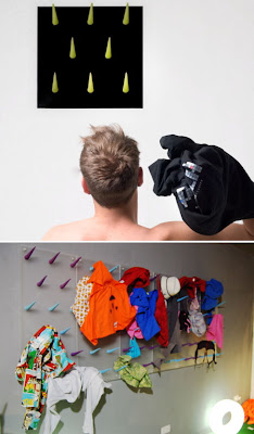
Wardrom: Put that mess on your wall...

Running out of room for that mess of dirty clothes on your bedroom floor? Italian design group Paula has a way for you to keep the mess, but extend it to the wall! Wardrom is a modular system of funky wall spikes designed to catch tossed clothing. So, it basically takes a bad habit, and makes it even more fun. Spectacular.

[via Dezeen]

Eco Brolly: Innovation with a dash of irony...

British designer Shiu Yuk Yuen delivers this nice little green-design concept: the Eco Brolly, which uses any old newspaper as the rain-blocking material in a portable umbrella. It's innovative in that it cleverly upcycles trash, reduces the bulk of the umbrella when not in use, and lets the user dispose of the wet part instead of having to dry it later. And yet, it's a little ironic: the heavier and glossier the paper, the better this will work; but those are the least-green magazines out there!

Usable Fix: Auto-power-cycling modem...

Sometimes I love bad designs just for the ingenious hacks they can inspire - and this one, my friends, is a doozie. Many people (myself included) have cable or DSL internet where the modem sometimes just stops working and needs to be "power cycled" - that is, unplugged and plugged back in. This is inconvenient, especially when the cable is hard to reach - and of course, there's no power button on the damn thing. Well, the brilliant (and nameless?) guy at Stupid Hax has automated the power-cycling process: his router periodically checks for an internet signal from the modem. If it discovers a lack of internet, it flips a relay on the modem's power circuit off, then on again. Of course, this is exactly the kind of smarts that should have been designed into the modem in the first place - but the hack is so clever, I can't help but love it!

Two Rights Make a Wrong: Powerstrip orientations...

Reader Josh Shields sent this one in, and it's a great example of good intentions gone bad. At first, most powerstrips had the sockets oriented as shown at top, and most power adapters (AKA "wall warts") had plugs oriented in, well, the worst way possible for those power strips. The problem is that each party seemed to go off and independently solve the problem: they each rotated their sockets and plugs 90 degrees. The result is the situation shown on the bottom - back to square one! Of course, there's a mix of old and new powerstrips and power adapters to be had out there, so it's possible that you'll get lucky and have a properly mismatched pair. But this is a case where some good design, cooperation, and even standardization could help! In the meantime, here are a couple of solutions: the PowerSquid, and rotating power outlets. Thanks, Josh!

Lazy Journalism: "A Google search for..."

This blog is about "design" and "usability," but I often interpret those terms fairly loosely. This post stretches their definitions into the realm of journalism, and may be better classified as rant than critique - but here we go! I was reading the June 21st issue of Newsweek, and twice in the space of a few pages encountered this journalistic abomination: "A Google search for _____ yields X million results." Jessica Bennett and Jesse Ellison committed the first offense ("bridezilla," half a million hits), and Raina Kelley is guilty of the second ("pictures of dead people," 200 million hits). Folks, this is NOT journalism: this is the laziest possible way to say "this thing exists." The Internet is unfathomably huge, and Google has indexed most of it; a search for practically anything will yield a high "hit" number that can be used - inaccurately and irresponsibly - to bolster your case. It's misleading, it's unscientific, it's useless, it's a poorly-designed writer's crutch - and worst of all, it works too well. In an age of "truthiness" standing in for truth, this trick should be purged from responsible publications. Now go do some real research. Thank you.

Self-Standing Toothbrush Concept

Presumably using the same cutting-edge technology found in Weebles (which, of course, "wobble but don't fall down"), the DEWS Toothbrush by Ryan Harc keeps itself safely upright in your filthy bathroom. I like the safety of this concept - after all, a toothbrush with a flat base would be able to be stood up, but these are weighted to resist even being knocked over. During those barely-awake early mornings or late nights, that could make all the difference.

iPhone Maps: Turn'em any which way...

My lovely wife pointed this one out last weekend, as we were using her iPhone (3G) to navigate to a friend's birthday party: she's happy that the maps application doesn't switch between portrait and landscape modes, because she can hold the phone so the map is oriented to the real world without worrying about it switching around on her. I hope this is a design decision, not just dumb luck on Apple's part! And to be honest, I don't know if things are different on the 3GS or 4 with their built-in compasses. But one way or another, well done, Apple!

Hoodie with Earbud Drawstrings

Own a hoodie? How many times have you used the hood drawstrings? And how often do you use earbuds? HoodieBuddie asks, why not replace something you don't use with something you do use...?

(On the other hand, how do you wash this thing?)

Hatcams: Weird for now, but just the beginning?

Behold: Hatcams, baseball caps with standard camera-mounting fixtures on the bill. (I'll give you a second to stop chuckling.) But seriously, this could just be the beginning. For now, it's silly - cameras are too big and conspicuous, and god help you if you want to start and stop recording. But cameras keep getting smaller, and batteries and memory will last longer, so I can certainly imagine a sleek and socially-acceptable camera built into clothing - and always recording. It's similar to lifecasting, but more for the purpose of catching memorable life moments before they're over - and without interfering with your ability to experience them. Aside from that, imagine the value of having a video record of any altercation, car crash, or crime... Privacy may be the victim, but the possibilities are mind-boggling!

[via Gizmodo]

Koreatown Hotel Elevator Buttons - Where do I start?

In the title of this post, I ask "where do I start?" Usually this would be a rhetorical question indicating a plethora of design problems - but in this case it's also literal, since the buttons are in such a strange order! Why would the first floor be in the bottom right, but then the rows still go up...? Even looking at it now, trying to anticipate where any button should be hurts my brain. The presence of always-confusing B1 and B2 levels sure doesn't help. The only explanation I can imagine is cultural, with the order relating somehow to the order of reading/writing the Korean language. Other than that, I'm dumbfounded...

NoteTabs: Uses for transparent Post-Its?

Office supply maker Avery has a solution looking for a problem: NoteTabs, which are essentially transparent Post-It notes. They're pitching these as a solution for highlighting or annotating materials that will eventually have to be returned in unmarked condition - borrowed books or original documents, for example. I'm sure these needs occasionally exist - what I'm not sure of is whether being able to directly superimpose your notes, rather than slap a Post-It alongside the material, is worth buying a whole separate product. If I'm missing something, fill me in - otherwise, I'll stick (ha!) to my Post-Its.

Natural Mapping: Buttons done right...

While researching an upcoming presentation, I returned to the subject of "natural mapping" in buttons and other user interfaces. I was first introduced to it by Don Norman's "The Design of Everyday Things," which contains the classic example of mapping knobs to burners on a stove: a row of four knobs doesn't map to a 2x2 square of four burners, but a similar 2x2 square of knobs is immediately obvious. Anyway, I found this image of a wonderfully naturally-mapped control for powered adjustable car seats. Move the little seat parts any way you like, and the real seat follows. It's simple, obvious, and intuitive - and makes for some very pressable buttons!