This is generally a blog about usability, but I'll definitely accept an item which keeps usability and simply adds the ethereal quality of "delight." These barcodes fit the bill - from Japanese firm D-Barcode, they leave the codes just as easy to scan by laser, but add a little something designed to make people smile. Hey, it worked on me!
[via Neatorama & Make]
Product design use and usability, designs new and old, inspired and unspired. The little things that matter.
Pick up the phone, silence the ringer - classic!
Once upon a time, "telephones" were things that sat on desks - and when they rang, you would "pick up" the phone to answer it. It seems antiquated in an age of ubiquitous caller-ID, where you always want to see who's calling (which requires picking up the phone) before answering (which now requires pressing a button). But the HTC HD2, among other Android smartphones, has designed a bit of useful nostalgia: the phone's ringer silences (or at least reduces volume, I can't quite tell) when it's been physically picked up. This is a great idea - it reduces the time from annoyance to silence, and may even allow someone to silence a phone in a bag or purse by just jabbing at the thing. However, it's an idea that requires a robust solution - what if the user is walking or jogging, so the phone (and accelerometer) is constantly being jostled around? The ringer might be silenced before the user has a chance to hear it! The solution - which I hope was used - is only to enable this feature if the accelerometer has been stable, indicating little or no movement, in the moments prior to the ring. Great ideas deserve this kind of robust implementation!
[via User Centered]
[via User Centered]
Know-It-All Pencils - More real estate for info!
If you're a gradeschool student using a pencil, you spend a lot of time with that little wooden stick in your hand - so hey, you might as well put it to good use. Etsy's Know It All No. 2 Pencil Set consists of normal pencils, each of which is emblazoned with a simple something that's worth remembering. It may seem like a piddling little effort at education - but I bet that every student who uses one of these actually has that fact memorized for life by the time it's sharpened down to a nub. Presence of information plus a captive audience equals memorization!
[via Make]
[via Make]
Freedom Leg: Look ma, no hands!
Crutches perform the necessary function of taking the weight off of a lame leg, but beyond that they're very inconvenient - they occupy both hands, cause mild armpit burns, and take up space both during use and, well, at all other times. Freedom Leg asks why you should involve the arms at all - why not just use the same leg farther up, where it's not injured? The result is a kind of temporary prosthesis that looks much more convenient than normal crutches - I only hope it's a little more comfortable than it looks. Check the site for a video of it in action - it's definitely impressive! If I break a leg, I know what I'm going for...
[via Gizmodo]
[via Gizmodo]
AccidentSketch - A good tool for when you need it...
Product design often seems to exist in a perfect world, where people use products as intended (and the products work as intended) and everything is free of scratches, smudges, wear and tear. But hey, the real world needs good design, too - and here's a great example of it. AccidentSketch is designed precisely for those moments when things go wrong - when you've had a car accident and need to explain and document exactly what happened. A simple written account is the norm, but it's ill-suited for the complexity of an event that occurred through time and in 3-D space. AccidentSketch's well-designed drawing tools help you put the scenario together clearly and easily - though I would have loved to see animation as an option. Still, it's a great design, a thoughtful offering, and a worthy tool for when you need it.
[via Lifehacker]
[via Lifehacker]
Spend/Save Bank Leaves Financial Planning to Chance
If you're the type who already makes most of your decisions with the aid of a magic 8-ball, here's another cheap gadget to help take the burden off your brain: the Spend / Save Bank from Taylor gifts "rewards you one way or another" by randomly deflecting your coins into trays marked SPEND and SAVE. At first glance it seems like SAVE is larger than SPEND, which is good messaging - but if the sorting is really random, then it's false reassurance. And ironically, the first sign that you need someone or something else to make your financial decisions for you may be the fact that you wasted 20 bucks on something like this...?
[via Gizmodo]
[via Gizmodo]
Text Area Resizer - Give yourself room to type!
"Web 2.0" is the term that's been coined to indicate the vast shift to user-generated, social content on the internet. That means hundreds of millions of users are out there composing text, image, and video content for websites - and they're doing that composition on the websites themselves. To make this easy, site designers need to make sure that the content-generation experience is as smooth as possible - but some are still stuck in Web 1.0 design principles. One telltale sign: a text box too small for the content it's going to receive, which leads to lots of scrolling and a frustrated user. NettiCat comes to the rescue with a text-area resizer extension for Firefox, letting users pull, stretch, and move the text box any which way they like. And hey - users improving sites with add-ons, that's Web 2.0 in action itself! The system works!!
[via Lifehacker]
[via Lifehacker]
Phonewords on a Blackberry...?
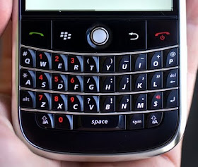
Pop quiz, techies: how do you dial phonewords (of the format "1-800-LETTERS") on a Blackberry keyboard like the one in the photo? It's a problem deftly identified by fellow usability blogger Jasper of Uselog a few months back. Remarkably, it turns out that Blackberry provides a solution: Geekberry points out that you simply press "shift" and then spell out the word - the Blackberry will do the conversion and dial the right number itself. Of course, that trick isn't exactly obvious - it definitely requires you to RTFM. Usable enough? Doubtful - it will completely evade anyone who's not in the know, and even those who read about it may dial phonewords so infrequently that they'll forget the trick in between uses. Advantage, iPhone...
Bikes Triggering Stoplight Car Sensors
You're a cyclist - good for you! You're getting exercise, conserving energy, and reducing traffic. And what thanks do you get for it? Waiting an eternity at stoplights because your little bike doesn't trip the car sensor, so it thinks nobody's there. Grr. Turns out, there's a fix for that - it's not exactly elegant, but it works, and it's well-documented and patented. That's it in the image - well, part of it, the rest of the electronics are up by the handlebars. It's definitely a workaround for a poorly-designed system - the real design fault lies with those who engineered the car sensors without considering cyclists. Moral of the story: it's tough to do the right thing in a world designed to help people do the wrong thing!
[via Make]
[via Make]
Gmail Double-Checks Your To: Line...
Google is at it again, making computers smarter and smarter to make your life more convenient and eventually take over the world. This time, the uncanny intelligence is being applied to the To: line on your Gmail, with a Google Labs feature called "Got the wrong Bob?" It works by analyzing what groups of people you usually email together, and flags any unusual-but-similar address you may accidentally add to such groups. It's something that's happened to all of us at some time, and it's nice (if a bit creepy) to know that Gmail has your back. This joins other ingenious Gmail features I've covered, like the decency filter for ads, automatic unsubscribe, time zone help, and my favorite the forgotten attachment detector. Keep it up, Google - I, for one, welcome our pending computer overlords...
[via Esquire & Gizmodo]
[via Esquire & Gizmodo]
Color-Coding Your Fuel Efficiency
With a new emphasis on fuel efficiency in consumer cars comes a new design challenge: how to communicate feedback to the driver. Most feedback in cars is either numeric (speedometer), analog (engine heat), or visceral (feeling and hearing the engine). So, if the driving style affects fuel efficiency, which of these is the best way to supply that information to the driver? The Prius has always gone for numeric, displaying instantaneous gas mileage and discrete units of energy recovered from braking. But Honda has decided to add color-coded feedback - which I might call visceral (even though it's visual) because it's ambient. Drivers will be conditioned to feel like they want to the display shown in the image to stay green - not blue-green or blue, which indicate less efficient driving. It's one thing to let a number creep a little higher, but it's a whole different feeling to have a color change to rebuke your driving! I wouldn't be surprised if this technique turns out to be impressively effective. It could be great proof that efficiency can be accomplished by feats of usable psychology in product design...
[via AutoBlog, Engadget, & Gizmodo]
[via AutoBlog, Engadget, & Gizmodo]
Remove Gmail Ads with "Decency Filter"
Gmail makes an income for the Google mothership by putting contextual ads alongside your messages - eh, nothing new with that. But it turns out Gmail has a built-in conscience, and that conscience (like most) can be used against it! Joe McKay figured out that by adding a few words to any message, all ads would disappear - specifically, words that would suggest tragedy. Iterating one more step by integrating the necessary words into a self-explanatory sentence, Lifehacker suggests the following ad-killing signature: "I enjoy the massacre of ads. This sentence will slaughter ads without a messy bloodbath." Nice. Of course, Gmail and Google are nothing if not smart, so it's only a matter of time before their algorithms compensate for this trick. But in the meantime, we humans can enjoy a brief lead in the advertising arms race!
Piano Stairs - Using fun to change behavior...
This is a great little project that shows how invoking "fun" can be a useful tool in changing peoples' behavior. It starts with the problem, clearly showing how people tend to prefer an escalator over an adjacent staircase - thereby consuming extra electricity and missing an opportunity to get a bit of exercise. The mischievous crew behind the experiment then outfits the staircase too look like piano keys and wires them to play each note as the stair is stepped on. A charming video montage later, practically everyone is taking the stairs. I'm sure that some users play around on the stairs and block traffic a bit, and I'd be surprised if there weren't a few collisions here and there - but the project makes people happy and changes behavior for the better. That's win-win!
[Thanks Dad!]
[Thanks Dad!]
Useful Desktop Wallpapers - More than just a pretty picture...
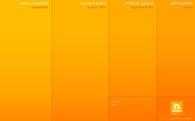
Most people, myself included, use their computer desktop wallpaper purely as decoration - a photo of family or pets, or something scenic or inspiring or just plain cool. But Lifehacker points out that they can be useful, too - they feature a small gallery of wallpapers that help you sort the clutter on your virtual desk into meaningful categories to help your organization and workflow. They range from labeled bento-box (like the one pictured) to crazy flowchart to (my favorite) unlabeled desktop-literality to brutally honest (see the white-on-black text one). Check it out, and see if one might fit your needs...
Friday Fun - iPod-stashing necktie...
In keeping with the quasi-tradition of Friday frivolity here at Unpressable Buttons, here's an idea that's good for a laugh (and not much more): a necktie with a hidden pocket for your iPod. They're from Thomas Pink, and actually available (!) at the head-shaking price of 55 British pounds, or about 90 US bucks. The use speaks for itself - it's not a bad place for your media player to live, honestly. But the list of downsides is too big to ignore: where does the cord come out? How do you control it? How does it make the tie hang or move differently? How could you look yourself in the mirror as you put on this $90 tie and wire yourself up?? And that's just for starters...
[via Make]
[via Make]
Archive Binge - A steady drip of webcomics...
The scenario is one with which you may be familiar: you discover a webcomic that's new to you but has been around for a while, and decide that you've gotta read the whole series from the start. (Okay, you're only familiar with this if you're a huge nerd like me.) But webcomics are addictive, and you risk your whole day if you allow yourself to sit and click "next" ad infinitum. Archive Binge exists for exactly this situation, solving the problem by creating a custom RSS feed (remember I said you need to be a nerd) that will gradually get you caught up. The site's design is, ironically or not, mired in the late 1990's - but it looks like it gets the job done. Your employer will thank you.
[via Lifehacker]
[via Lifehacker]
Alarm Clock for Sideways Sleepers
If you (1) always sleep on your side and (2) have trouble rotating your own vision 90 degrees, Greg Wolos' "Emily" clock may spare you a lot of sitting up in the middle of the night. If either one of those things isn't true, then ol' Emily is merely a conversation piece, and a bit of a rip-off at $129...
[via Gizmodo]
[via Gizmodo]
"No Signal" - A usable plot point?
Horror movies have always depended on the victims' being isolated from help, which is one problem that cellphones have been adopted to avoid. So what's the modern horror movie to do? Rely on "no signal" as a plot point - and here's a nice summary of a bajillion such plot points in various movies. With current cell coverage less than complete, this still works - as one character puts it, "97% national coverage and we find ourselves in that 3%." But in the near future it'll (hopefully) seem a lot less believable. Horror writers, start thinking up new plot devices!
[via Nerdist & Gizmodo]
[via Nerdist & Gizmodo]
Will Wallets Merge with Phones?
The list of items people need to have on their person at all times has changed in the last few decades. Watches used to be critical to keep time, but have been replaced by the always-correct cellphone clock (except for watches worn for style); a personal schedule and notepad were first replaced by the PDA, then the PDA merged with the phone. All that's left is the phone itself, wallet, and keys - and I think the wallet may be next! The photo is of the Case-Mate, which keeps your ID and bankcards piggybacking your iPhone; in my opinion, it needs room for another card and some cash to make a real bid for wallet replacement, but it's a start. Loyalty and membership cards have already been covered by apps like CardStar, which has made my wallet quite a bit thinner. It's only a matter of time before a phone will be used as a method of payment (as it already is in Asia), and receipts can be paperless in the form of emails (like the Apple store already does) or text messages. And if the wallet's last remaining use is for photos of family? Well, your phone can carry a few thousand of those, too. I think it's where we're headed, and I for one am looking forward to it!
Connector Orientation - Can I get a little help...?
Industrial designers these days like things to be symmetrical and "clean" - which gives us (admittedly attractive) simple shapes for buttons and rows of identical switches. But this ignores the human need to associate a unique physical feature with each function - and Lifehacker has a great case in point. A reader of theirs by the name of Jon observes that the Zune cable is symmetrical, with nary an indication as to which side is "up." His solution is pretty elegant: a single drop of superglue, which not only maintains the clean design aesthetic with a durable fix, but gives the connector both a visual and tactile orientation cue. That gives it an edge over the iPod/iPhone cable, even, since those only have a faint graphic but no tactile cue for orientation. Well done - now designers, pick up this trick!
Camper Bike!
If you're the type who'd love to see the great outdoors while touring the country in an RV, consider that the RV is also kinda destroying the great outdoors - have you seen the gas mileage on those things?? If you're a hardcore environmentalist, try out the Camper Bike by artist Kevin Cyr. Sure, it may not have a bathroom or a shower, but it's got you covered with an old-school tube TV to match the retro styling. Plus, you'll definitely get admiring stares from passers-by and curious bears - and some strong leg muscles to boot!
[via Make]
[via Make]
Earphones Enable Natural, Gestural Control...
Sony is pitching a new technology baked into its latest earphones called SensMe, and despite my skepticism about its name (and the weird cartoons explaining it), it seems pretty darn useful. The gist: sensors in the earbuds themselves enable you to control your phone and music player by inserting or removing the buds from your ears. Insert two buds, and the music player starts; remove one, and it pauses. Insert one bud to answer a call, and remove it to hang up. The concept isn't without its problems - I wonder how it would accommodate people like me who prefer to do phone calls with both earbuds, and it would be unpleasant to accidentally hang up if the one earbud fell out during a call - but its goal is admirable. It assumes commands to your device based on the other actions you have to take anyway in order to start a certain function, making the commands gestural and natural and streamlining the whole use of the product. I'll be looking for this!
[via Gizmodo]
[via Gizmodo]
Modular Knife Block - Store only what you need...
My wife and I recently had this problem: a knife "set" cobbled together from different sources and comprised of different styles and brands, and trying to find a knife block that would fit them all. We got lucky and made it work, but designer Aaron Root has a (student-work) concept that would have made it a bit easier: modular knife blocks. Each knife comes with its own little block, sized just right for it - and the blocks attach to each other with strong rare-earth magnets. That way, as you gradually build your knife set, every knife has a perfectly-fitted slot - and there are no sad empty slots wasting space. Let's hope one or all of the knife makers (er, knifesmiths?) picks this idea up!
[via Yanko & Gizmodo]
[via Yanko & Gizmodo]
Healthy Messaging, Snuck Into Snacks...
Colgate and ad agency Y&R teamed up for this little gem: a hidden message on a popsicle stick which reveals itself once you're done with the treat. It's socially responsible for the message to be healthy, of course - in this case, a reminder to brush your teeth - but a more tantalizing prize might make the whole experience even more (dangerously?) addictive. Yeah, probably best to stick with oral hygiene.
[via I Believe in Advertising, Inspire Me Now, & Gizmodo]
[via I Believe in Advertising, Inspire Me Now, & Gizmodo]
Floating Pliers - The right tool for the job...
Hey, if you're working on a boat, or otherwise atop a large body of water, you just need floating tools. A lanyard just gets in the way; installing a safety net is a pain; retrieving sunken tools could be fun, I suppose, but only if you're into snorkeling. But really, if you just bought a fixer-upper boat and are looking forward to weekends of maritime projects, get these floating tools. They're the right tool for the job!
[via BoingBoing & Gizmodo]
[via BoingBoing & Gizmodo]
"Your Speed" sign uses some creative unit conversion...
Signs which display your speed alongside the road's speed limit are usually pretty straightforward; the only brain functions required are subtraction and guilt. But as Marc van Wageningen posts at DirectDaily, the Elm Grove police department has applied some creative unit conversion to your miles-per-hour: signs are displayed in thousands of dollars of accident bills, days in hospital bed, percentage chance of crashing, etc. The question is whether this is any better than the basic-guilt strategy of normal speed-checking signs. Does it make you think a little more about speeding? Sure. Does that absentmindedness ironically increase your chance of getting into an accident? Hmm...
[via Gizmodo]
Shoe Bumper Stickers - Aww...
Flickr user Laser Bread, aka artist/musician Brock Davis, has come up with and Photoshopped this concept for shoe bumper stickers. Read the messages, they're worth a chuckle. But would these stickers be useful in any way? (The theme of this blog requires that I analyze them through such a lens, no matter how cute they are). Unfortunately, no - bumper stickers access a captive audience in drivers, by locating messages where those drivers are already looking. Shoe bumper stickers, however, are too tiny to see, are located where you're not usually looking, and are whipping around at such a speed as to be totally illegible. But do they work as a conversation piece? Why, perfectly!
[via Make]
Nesting Pots & Pans for Small-Space Living
MSR, which stands for "Mountain Safety Research," mostly makes equipment for outdoor adventure: mountain climbing, backpacking, all that good stuff. Space is at a premium in those situations, so they're good at making their gear compact. But outdoor adventure isn't the only place where compactness is important; plenty of people live in small apartments or dorms, and living well in those situations can be a challenge. So, MSR is helping those people out with the Flex 4 System Cookset - pots and pans to cook comfortably for 4, which all nest into each other for super-duper-compact storage. If your space requires it, I'm sure that design is a lifesaver - useful, usable, and efficient!
[via unclutterer & Lifehacker]
Wave Bike - Surfboard-totin' cruiser concept...
Bikes and surfing are both parts of the beach environment, but they don't really play well with each together - in that it's kinda tough to carry one on the other (and really tough to carry the other one on the other). In the interest of making the two more compatible, industrial designers Gegi Primanata and Rinda Setiawan have come up with this concept bicycle which allows the board to slide in the back and serve as the bike seat. It may or may not work in reality - I'm particularly concerned about the "wide stance" (apologies to Larry Craig) that might be required to pedal around a large surfboard, and the long "tail" may take out a few kids when making turns. But it's a neat idea - and I'd love to see one cruising along the beach someday.
[via Trendhunter]
Measurement Conversion Apron - Puts units where you need'em...
From Etsy, the Measurement Conversion Apron does three usable things: it puts cooking unit conversions where you need them (right with you while you're cooking), without taking up valuable space (because it just hangs down in front of you), and you can actually use them (because you won't worry about getting the apron dirty). Not a bad set of accomplishments for a single silk-screen print on a normal apron - but a bit of a rip-off for almost 20 bucks!
[via Lifehacker]
Gmail Unsubscribe - Makes un-subs as easy as marking spam...
It's easy to mark a message as spam in Gmail - there's a big fat button that sends the offending email to the spam folder, brings you back to your inbox, and filters out future messages from the same sender, all with one click. However, properly unsubscribing from non-spam email lists is more difficult - you usually have to reply with an email formatted in a certain way, or go to the sender's site and be subjected to confirmation steps and pleas to reconsider. Accordingly, lots of people just take the easy way out, and mark messages as spam just to unsubscribe from otherwise legit lists. The problem is that this makes Google's automatic spam detection less accurate, since the crowd-sourced spam identification on which it relies has been compromised. So Google, as it often does, has created a solution that is both good for them and useful for the end user: one-button unsubscription. It's just like the simple report-spam button, but behind the scenes, Google will try to unsubscribe you the nicer, more accurate, and more complete way. Thanks again, Google, for taking away more of the burden of surviving a digital life! (And thanks for Lifehacker for the image, since I couldn't find any of my own messages that cued the unsubscribe button!)
Coffee Mug for the Blind Chimes When Full
It can be fascinating to consider how you would perform certain daily tasks with impaired senses - and this one is indeed a head-scratcher. How do blind people fill coffee mugs without overfilling? Feeling the weight of the liquid would be difficult because the mug already weighs so much; a paper or styrofoam cup may be easier for that reason. It's also possible that single-serving coffee machines are a common method. Well, however they may do it now, designers Sang-hoon Lee and Yong-bum Lim have a solution that's probably easier: a mug that chimes when it's full. It seems simple, straightforward, and actually capable of being produced. And most importantly, it makes a situation more usable for some of the people who need it most.
Smart Measure Cup - Concept vs Reality
The Smart Measure Cup started off as an industrial design concept by Ryan Eder and Chris Daniels of Priority Designs, and as since been brought to production by Taylor Kitchenware. The top of the two images is the concept rendering, the bottom is the actual product. So what's changed, and why, and how does it affect the user? Let's take a look...
-The color of the handle has obviously changed, but so has the material; it's no longer the soft-touch rubbery stuff that the concept implies with its seamless buttons, but instead a harder, harsher plastic. Right off the bat, this loses some desirability appeal, even if it doesn't affect actual functions or usability. But it may affect usability, if the buttons in the real version aren't sufficiently waterproof for washing!
-The LCD display has taken a hit, too; the real product gives up the concept's attractive dot-matrix display for a regular seven-segment type. Just a style change (and cost-reducer), but again, it loses some more visual appeal.
-The graphics on the sides of the cup have remained mostly the same, albeit a bit more tightly packed. However, Taylor's brand name has been added, and in a different font. Presumably they want to add the logo to associate their brand with a quality, innovative product - but ironically, the logo in fact detracts from the overall aesthetic, making the product feel cheaper. Ouch.
So there you have it - usability is pretty much unaffected, but something about the soul of the product has been lost. It happens a lot between concept and reality - and you can't benefit from the use of a product that you're not motivated to buy!
[via Gizmodo]
Ring Bluetooth Headset - Solves the problem of where to put it...
Bluetooth headsets are generally fine gadgets, but they're less compelling as fashion statements. People who keep them in their ear nonstop are easy targets for ridicule, but stashing them anywhere else negates their quick-access raison d'etre. The Orb, shown here - apparently a real product coming soon from Hybra Advance Technology and AbsolutelyNew - tries to solve that problem by putting the headset on your finger when you're not on a call. It's a (reasonably sized, comfortable?) ring which "twists" out to become a snakelike earpiece. Looks great, sounds useful... I just hope the real thing ends up looking as good as these renderings!
[via Gizmag & Gizmodo]
[via Gizmag & Gizmodo]
StillTasty - Important food info, presented well...
I'm no food expert, especially when it comes to how long certain things will last - on the shelf, in the fridge, in the freezer? Opened, unopened? Cooked, raw? It's bewildering - and I'm sure I've wasted plenty of good food by playing it safe. But now I've got help - StillTasty.com provides exactly the information I'm looking for anytime some grub is questionable, and more importantly, provides it in a robust and user-friendly way. It differentiates between different types of the same food (was it purchased refrigerated or on the shelf?), opened and unopened containers, storage situations, and more - and this thoroughness lends it a reassuring credibility. It's easily searchable, presented with a clean straightforward design, and even adds tips for food storage after you get your answers. I'm a fan - and it's definitely a site I'll find myself using again and again...
[via Lifehacker]
[via Lifehacker]
Take Back the Beep - Stop wasting money on voicemail instructions!
New York Times tech writer David Pogue has launched a grassroots campaign called Take Back the Beep to demand that cellphone carriers eliminate the time-and-money-wasting instructions you hear before leaving voicemails. These are the instructions that come after the personal greeting - the ones that tell you, oh so helpfully, that "the person you are trying to reach is not available," and "when you're finished, hang up" and give you useless options like "to leave a callback number, press 5" or "to send a numeric page (wtf?), press 7." These instructions are less than useless, they're insulting - and even worse, they're costing us money. I blogged about Pogue's initial discovery that these instructions are intended to cost users money, to increase overages and yield more profits for the carriers. Well, it's time to put a stop to this - and here's hoping that Pogue's campaign does the trick. To help, go here for his instructions on how to contact and complain to the various carriers. Take back the beep!!!
iConcertCal - So obvious, and pretty useful...
iConcertCal is a program that works with iTunes to find upcoming concerts in your area by artists that you like, based on which artists are represented in your song library. It was originally an iTunes plugin, and is now an iPhone app as well (iTunes store link) - and provides useful features like direct links to purchase tickets, venue maps, and more. It's really quite obvious, just plain genius - and a very, very usable design!
[via Gizmodo]
[via Gizmodo]
Keyring Key - Sure, why not?
Want one less piece of metal jangling around in your pocket? Get one of these keys from Amron Experimental and ditch the keyring. It's one of those ideas that's so good it makes you feel stupid for not having thought of it. Sure, there are problems: that becomes the one key you can't remove from the others without causing a mess, there may be practical metal-strength problems, and so on. But just look at it, and tell me it doesn't feel right! Not bad.
[via Gizmodo]
[via Gizmodo]
Cablox: Wrangle those cables!
An increasingly wired world means... well, increasing wires. Many of us now have computer and/or home theater setups with oodles of cables all over the place, making an unsightly rats' nest surrounding our expensive gadgets. There are a number of cable-management solutions out there, but here's one that just looks a bit more clever than most. Instead of a single clip for a single cable, CABLOX is a grid of mushroom-shaped pegs, to route any number of cables any number of directions. With an upcoming move and a chance to make my own setups a little tidier, I just might go for some of these myself...
[via Wired and Gizmodo]
[via Wired and Gizmodo]
Cellphone-Camera Microscope: Field tool for the developing world...
Pete Kazanjy is at it again, finding so much material for this blog that I'm starting to feel guilty that he's not on the payroll. This time, the suggestion came with a disclaimer, "not sure if this is Unpressable Buttons material" - oh, Pete, it certainly is! The subject is the development of a microscopy attachment for cellphone cameras, by the University of California at Berkeley. The value of such a tool may not be obvious to most of us, but that's because most of us have never been where this tool has value: in the clinics of the developing world, where (according to the article on ScienceBlogs) "resources are limited and laboratory facilities scarce, but mobile phone networks are ubiquitous." This attachment provides the necessary hardware to enable life-saving diagnoses, while keeping costs down by leveraging existing devices and infrastructure. That is good, usable, well-thought-out product design!
SmartSwipe - It may swipe, but it ain't smart...
Are you a shopaholic struggling to make the transition from brick-and-mortar sprees to online splurging? If so, the SmartSwipe may be for you: it verrry slightly simplifies the task of online shopping by letting you swipe instead of type in your credit card, and hey, the device itself is yet another useless purchase that will give you that shoppers' high! Seriously, though, the company claims security advantages, but I'm highly doubtful that this is more than marking fluff; really, it's a way to swap one data entry method for another. And for 90 bucks? Well, I'm just not buyin' it...
[via Gizmodo]
[via Gizmodo]
Bookmarking Reading Lamp - A nighttime trifecta...
I've posted about something similar before, but this latest concept from designers Jun Yasumoto, Alban Le Henry, Olivier Pigasse, and Vincent Vandenbrouck (wow, that's a lot of credits) adds one more feature to the list: it's (1) a reading lamp that (2) serves as a bookmark, and (3) is turned on and off by the book itself. Yup, placing the book onto the wedge of light saves the page and turns the light off in one fell swoop; picking the book back up turns the light on. Simple, functional, and even intuitive - for the limited real estate on one's nightstand, that's not a bad combo!
[via Gizmodo & Core77]
[via Gizmodo & Core77]
Sniper Rifle Cup Holder - Deadly and refreshing!
Product designers often opt out of designing weapons for moral/ethical reasons, but hey, someone's gotta do it. And sometimes those who do it come up with interesting things - and this, for better or worse, certainly qualifies as "interesting!" Yup, this is a cup-holder that attaches to your sniper rifle, thanks to Badger Ordnance. So, is this frivolous or useful? At first it seems ridiculous that such an ordinary accessory should go with such an intense product, but with more thought it makes sense: a sniper's job consists of lots and lots of waiting. That waiting is often in the military hot spots of today, which tend to be hot and dry. Why shouldn't the sharpshooter have a libation to quench his thirst? Just hope the target doesn't show up while you're in the middle of a sip...
[via Wired & Gizmodo, photo by Bryan Jones]
[via Wired & Gizmodo, photo by Bryan Jones]
Double Shower Curtain Rod - You're doing it wrong...
Pete Kazanjy, a friend who's such a frequent contributor that he should almost be listed as a co-author of this blog, has another gem for us. Remember the simple and practical double shower-curtain rod, with an extra bar for towels or clothes? Well, Pete spotted one for sale out in the wild - but with a photo on the packaging that gets it all wrong. The towel is hanging inside the shower curtain, dooming it to become soaked during the shower instead of drying you after it. Maybe this just makes a more attractively composed product photo - or maybe the photo crew didn't give a hoot - but it's just a bit sad. The bright side is that it would take a real user just one shower to discover their error!
Laptop Notification Light - Why isn't this a real feature?
The image at left is a hacked, home-built feature added to a standard netbook, but it's pretty darn brilliant: a single tri-color LED, visible at all times (even when the laptop is closed) illuminates in different colors depending on whether there's activity on the user's email, IM, Twitter, or whatever. My question is, in an age of constant connectedness and instant updates, why isn't this a real product feature being offered by PC makers? Of all the lights that are visible on a laptop - power, hard drive access, wireless, bluetooth - why couldn't one be something just like this? It adds value, it would be cheap to implement, and could be as easy to use (for beginners) or customizable (for power users) as the owner wants. C'mon, PC makers, pick this up!
[via Engadget]
[via Engadget]
Gadgets vs Social Interaction
Fellow usability blogger Jasper posts on his Uselog site about how mobile web devices (yeah, iPhones) are throwing a wrench into normal social interactions. Good old-fashioned conversational delights give way to whipping out the phone to look up some fact, photo, or video; or worse, those present decide that their company is less interesting than texting those absent. He also found this photo, from Flickr user garrettmurray, showing no fewer than five iPhones in use at an (otherwise) fun social gathering. Maybe some of the fun in conversation, what makes it work, is not knowing the answers immediately by looking them up, but instead talking about and debating them... Something to think about, or laugh at, either way!
Spaghetti Measure: Neat, but why not get a scale?
This aperture-sporting little gadget is Joseph Joseph's Spaghetti Measure, which quantifies your pre-cooked noodles by cross-sectional area. It's cute, and visually compelling, and has the guise of usefulness - but how useful is it, really? I can think of a few problems: the "serving size" numbers are arbitrary and can't seem to be translated to standard units; the measurement depends on spaghetti of a certain diameter and length to be consistent; and worst of all, this is a one-trick wonder that only works on spaghetti noodles, not any others! If you're going to get a truly useful pasta-measuring gadget, find a lightweight kitchen scale; it's good for pasta of all shapes and sizes, and other small measurables as well. It may lack the cuteness factor, but I wager it'll serve you better for years.
[via Gizmodo]
[via Gizmodo]
RunPee on iPhone: Perfect marriage of utility and platform...
RunPee, the service I previously wrote about in its website form, has made the platform jump from PC to iPhone. This is a definite usability improvement, because now the info is there where and when you need it, in your pocket as you squirm in the theater waiting for a good time to go. The utility provided by RunPee remains excellent: for each movie, it tells you (1) how many minutes into the movie to go, (2) a "cue" of spoken dialogue or other signal to make a break for it, (3) how long you have to do your thing before the action picks back up, and (4) what you missed while you were away. It's probably about as close to perfection as anything with "pee" in its title can come!
[iTunes link, via Lifehacker]
[iTunes link, via Lifehacker]
iPhone Podcast Scrubbing - Getting better, bit by bit...
I listen to a lot of podcasts on my iPhone - NPR when I feel like substance, Sarah & Vinnie when I feel like trashy goodness - but the iPhone's interface for podcast listening has never been great. When I first got the thing, the problems were pretty glaring - for example, the podcasts played in reverse chronological order, which made no sense for three-hour shows broken into chunks. Things have gotten better since then, one piece at a time, and there's one feature in particular that I'd like to point out about the latest update. "Scrubbing" a podcast - that is, moving the position slider to get to a different time in the recording - was previously a difficult task. An hour-long podcast displayed as a 1-and-a-half-inch slider to be manipulated with a large index finger meant an accuracy of plus or minus 3-5 minutes - not good enough! With the latest update, though, the iPhone offers variable-speed scrubbing; as seen in the image, drop your finger down in the area below the position slider, and it will have a finer effect on the scrub. The area is broken into regular-speed, half-speed, and quarter-speed, and "fine" scrubbing, which is learned quickly enough with a little hands-on (or fingers-on) fiddling. Even better, the audio automatically plays at the new location before you remove your finger, so you can get feedback on the new location before finishing the scrubbing operation. It may seem like a small improvement, but it's a big deal for those of us who (now) use it a lot. And it's not just me, I promise - Eddie Lopez at User Centered has been meticulously chonicling the features and omissions of the iPhone and other products. Keep on making it better, Apple -and we users will keep pushing you!
LightLane - Concept becomes reality!
Back in January I posted about a concept for a bike lane that's projected from your bike to the street, a novel and excellent idea for how a cyclist can create a safe space in which to ride. That concept is shown in the top image - and lo and behold, it's on its way to becoming a real product! The bottom image is the LightLane functional prototype - and I, for one, am impressed! I'd expressed some doubts in the comments of the original post, involving the brightness of the projection and battery life, but I see that some good choices have been made: the prototype eschews the "bike lane" logo and instead focuses on the two side lines, each of which is projected with its own laser. Also, the low-energy red light has been replaced with high-energy, eye-catching green - and anyone who's seen a green laser knows, they're tough to ignore! However, the battery life remains low - the site claims a 3-hour runtime, which means it's probably only a few trips per charge. But the designers also make the excellent point that the product's performance "is best when lighting conditions are at their worst, improving safety in the most critical situations." Very true - and this continues to be a very worthy endeavor. Bravo!
[via Gizmodo & Pete Kazanjy, thanks Pete!]
[via Gizmodo & Pete Kazanjy, thanks Pete!]
Get Home - The simple app for the intoxicated mind...
"Get Home" [iTunes link] is a dead-simple iPhone app from William Wilkinson of Little Pixels. Its purpose? To get you home. Its method? BIG COLORFUL BUTTONS. Yep, this app is clearly designed for people who have had a few too many drinks, have been kicked out onto the street outside the bar/club/party, and have no idea how to, ahem, Get Home. It seems to be well designed, though - if you're going to pick a limited number of buttons in such a situation, these are excellent choices. From taxicabs to phone-a-friend to public transportation to hoofing it, this app has you covered. As long as you don't drunkenly drop your iPhone in a puddle before you can use it, that is...
[via Gizmodo]
[via Gizmodo]
Stab-Proof Knives?
Taking the principles of product design to a morbid and creepy place, New Point Knives makes kitchen knives that purport to be "stab-proof" - the blade can still cut veggies and meat, but the blunt point is designed to foil any... uh, fouler play. Of course, the edge is still dangerous - but it seems logically true that the edge is necessary, while the point is generally only useful for non-culinary purposes. It's an interesting notion, as is the thought exercise of imagining which kinds of users would actually decide that they need to buy these instead of normal knives. And the tagline? Just stupefying: "Designed for cooking - nothing more - nothing less."
[via Gizmodo]
...And hey - this is Unpressable Buttons' 400th post! Thanks for reading, everyone!
[via Gizmodo]
...And hey - this is Unpressable Buttons' 400th post! Thanks for reading, everyone!