From Petitinvention, here's a concept for a not-too-distant future product: what might be called "smart glass," augmenting whatever you see through it with, well, whatever info you might want about what you're seeing. The concept isn't much different from heads-up displays (HUDs) used by fighter pilots - just less military, and, if possible, even more awesome. Check out the full gallery of possible applications for this concept, and you might just get the feeling that it's merely a matter of time before this becomes a real - and very useful - product.
[via Smashing Magazine and Small Surfaces]
Product design use and usability, designs new and old, inspired and unspired. The little things that matter.
Hidden iPhone Barcode - Conveniently invisible...
While using a camcorder in night-vision mode, a serendipitous Australian discovered something on his iPhone 3G: a hidden barcode right there on the phone's casing. It's actually a 2-dimensional barcode, which packs more info into a smaller space - and it's only visible in infrared, so it can be seen by the electronic readers that need it, but not by the human eyes that don't. While many electronics products sport similar serial numbers, most hide them inside battery doors, of which the iPhone has none. So why is this invisible code so usable? Well, because it's not relevant to human users, Apple is doing us a favor by getting it out of sight and out of mind. With fewer visual distractions, it's easier to mentally connect with the product and the content it serves. It may seem like a small difference, but when you add up everything Apple does to banish distractions - removing screws, battery doors, anything it can to keep things simple - it all adds up!
[via Engadget]
[via Engadget]
Flash Drive / Bottle Opener - Keeper for your keychain...
This combo USB flashdrive / bottle opener from Trekstor might at first seem silly (or awesome, depending on your point of view) - after all, what does portable data storage have to do with refreshing hoppy beverages? But shockingly enough, this union is actually practical - not for the functions performed, but because these are two things that many people definitely want to keep on their keychains. Combining the two makes the keychain smaller, lighter, and more efficient. I'll drink to that!
[via CNET and Engadget]
[via CNET and Engadget]
Dog Handi-Drink - Portable pooch water...
As a new dog owner, I'm starting to appreciate all the well-designed accessories out there for Man's Best Friend. Here's one we just picked up: the Guardian Gear Handi-Drink, which deploys and fills a portable water bowl whenever and wherever you might need it. The bowl folds out from the water bottle to which it's attached, and squeezing the bottle fills the bowl with as much or as little water as needed. The design is all it needs to be, no more and no less - and both very useful and usable!
Mark Hurst vs Automated Email - Fight!
Mark Hurst hilariously deconstructs an automated email he received from FedEx, and all the many and horrible ways that it's just plain user-unfriendly. From shouting his own name at him, to greeting him with serial-number gibberish, to "robot-Klingon" prose style, it's quite a list of indictments. He even suggests a (totally technically feasible) rewrite, setting a great example if anyone out there is listening - I'm lookin' at you, NoReply-ReturnManager@FedEx.com...
Toothbrushing Visualization Game
Oral hygiene can be a tough sell on kids with short attention spans, and a lack of real understanding of the technique of good toothbrushing can mean poor results. Tackling those two problems, Hao-hua Chu and colleages at the National Taiwan University have developed a Wii-like setup, using a toothbrush fitted with sensors that allow a computer to determine how it's moving in space. The brush, in turn, controls a game which "uses sound and vision to encourage children to scrub colourful dirt from a set of virtual teeth shown on a computer screen. As the child cleans their own teeth, they see an instant impact on the virtual teeth." It's certainly a worthy endeavor, and results have been positive - kids playing the game brush twice as effectively as regular brushers. So, an open-and-shut case of design making a necessary task both more fun and more effectively done - at least, as long as the game doesn't lose the kids' interest after a week or two...
[via Gizmodo]
[via Gizmodo]
Poka-Yokes: Silly name, useful tricks...
We're all designers, to the extent that we design our own lives: we come up with systems for ourselves, we teach ourselves habits that work, we choose the things we use and live with to create a whole, total, functional life. And it turns out there's a name for some of the things that we design for ourselves: "poka-yokes," described as methods which force our (future) selves to remember something or act in a certain way. The blog Design with Intent describes a few, some of which you may find that you already use: putting your cellphone in your shoes so you can't possibly leave home with it ("athlete's face" be damned); leaving papers for a coworker on a surface that they can't ignore, like their chair or keyboard; or, one which I myself use, leaving the battery/memory card door on a digital camera open when those items aren't in the camera. It makes life easier - more usable, some might say - when your future self doesn't have to wing it. Your past self can help!
[via Good Experience]
[via Good Experience]
iPhone Earbud Rebuttal - No good if you don't know about it...
Two days ago I posted a rave about the iPhone earbuds' clickable microphone - and coincidentally, the very next day fellow usability blogger Jasper van Kuijk posted a rant on the same subject! He makes the very good point that the button is completely hidden - the microphone gives no visual cue that it can be "clicked" - so that many users (himself among them, for a while) don't even know it exists. And it's generally kinda difficult to use a feature you don't know about! Other products' in-line controls look more like the Sony headset in the photo, with "touchpoints" that visually communicate their function. Hmm. To me, this is a case of "design for new users" versus "design for experienced users": the iPhone clickable mic is designed entirely for experienced users (who, once initiated, will appreciate its simplicity and tiny size), sacrificing intuitive discovery for new users (who won't be able to find it without explicit instructions). To me, that logic seems valid: people will own their iPhones for two years, and become "experienced users" in the first week or two. A little pain at the beginning in exchange for years of happy use seems like a fine tradeoff to me!
The Tivo Remote - A story of design...
Gizmodo has an interesting exclusive on the development of the Tivo remote - beloved by many (and envied by Comcast DVR users like myself) for its intuitive layout and ergonomic comfort. I find it particularly interesting that, since the remote had to serve an entirely new product category (DVR) and support the usage patterns that category wanted to enable (frequent forwarding, rewinding, pausing, etc), it was especially important that the remote be "comfortable for long periods of in-hand use." And to let users gain quick tactile familiarity with the button layout, "each button needed to have a distinctive feel, giving the ability to control the remote without even looking at it." This layout was apparently "surprisingly helped by the 'blank finger parking spots between keys' that were equally important." Fascinating stuff, yielding very usable results! Check out the whole article here.
iPhone Earbuds - Oh, that clickable mic...
I know, I'll try to keep the iPhone raves to a reasonable level on this site in order to at least maintain the illusion of objectivity, but this is one that deserves some appreciation: the clickable microphone (shown highlighted at left) on the earbuds that come with the phone. It does a great job of getting just the basic functions that you're likely to need right away, and making them available, well, right away. A single click pauses your music, a double click advances to the next tack; when you get a call, a single click answers, a double click sends to voicemail. I can't say how many times I've used all of these features, happy that I don't have to get all the way to the phone body itself in order to access them. Not only that, but the mic is designed to be "flatter" in the clicking direction, so it's tough to mess up - just fumble around and squeeze the darn thing, and it gets the job done. Yep - it gets the job done. Pretty much says it all, dont'cha think?
Gmail Adds Forgotten Attachment Detector
One of the wish-listable email improvements has been officially implemented for Gmail, via Google Labs - a Forgotten Attachment Detector, thanks to Gmail intern Jon Kotker. With Google's expertise in parsing text, it only makes sense that they'd be able to tell when you mention an attachment in the body of an email but forget to attach it. This feature simply puts up a quick alert box when you hit "send" if it thinks a file is missing. Brilliant, and simple; but it makes me wonder why it's something the team "had been experimenting with a few years ago here inside Google but had never launched." Instead, the attachment reminder feature in the third-party Better Gmail script had gotten the job done...
[via Lifehacker]
[via Lifehacker]
Green Energy Option: You're doing it wrong...
Hey, SMUD - yeah, you, the Sacramento Municipal Utility District - when I signed up to pay the extra fee in order to use 100% renewable energy, I thought I got the message through that I, you know, had some genuine concern for the environment. So why send me a completely separate mailing congratulating me on my choice??? You could have at least bundled the letter into some other standard mailing - or better yet, sent me an environmentally-neutral email. But a totally separate mailing - consuming paper and ink, incurring the cost of postage, and spending all that energy sorting and delivering it? This is not the way to "congratulate" people who want the green option! Seriously, it seems to be a problem with the design of the system: the components of the system can be green (renewable energy, paperless billing, etc), but the system that contains them isn't designed to leverage them with each other. If it were, as soon as I signed up (via phone) for the renewable energy option, they should have asked me if I'd also like to enroll in paperless billing. After all, anyone who does the former is likely to want the latter. In the meantime, I'll recycle that congratulatory letter, and hope someone out there is reading this...
iPhone Screen Protector, O How I Love Thee...
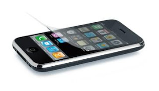
It's been a little more than a month since I took home my very own baby iPhone 3G, and in that time I've come to appreciate what I now know was one heckuva peripheral purchase: the screen protector. True, the phone itself is a hunka hunka burnin' usability, but the anti-glare protective film deserves some love, so here it is! First off, it gives me peace of mind; I know that any scratches can be banished for $14.95 (a new screen protector) rather than $400 (a new phone out-of-contract). Second, it's not kidding about anti-glare - the diffuse texture keeps shiny lights at bay without obscuring the display underneath. Third, it's very effectively anti-fingerprint - my greasy digits are powerless to leave smudges on this stuff. Finally, and this is perhaps my favorite, it's low-friction; like non-stick cookware, my fingertips glide across the display much more smoothly than possible on bare glass. It's so compelling that every time I use an iPhone without one, I can't help but think, "suuuucker!" And it's legitimate product design, too - finding that sweet spot, the combination of material, texture, thickness, and coating - it's not trivial! Hats off to you, screen protector; you're always welcome on my touchscreen gadgets.
PureText: Copy only what you want...
In my Windows and MS-Office existence, I tend to make more use of "Paste Special -> Unformatted text" than of the plain old CTRL-V shortcut. And hey, why not? It doesn't seem unreasonable that users would want to grab the content itself more frequently than the formatting that goes along with it - after all, what you're pasting it into already has its own format, thankyouverymuch. Recognizing this, freeware PureText gives you that function as a keyboard shortcut. It's the little things that can make using products delightful or miserable - and that goes double (or more!) for workarounds that you may have to employ dozens of times in a single day. Something like this might just keep some overstrained office worker somewhere from going postal - or a least delay it a bit...
[via Lifehacker]
[via Lifehacker]
iPods Have Outgrown Their Wheels...
Mark Wilson at Gizmodo writes a well-thought-out analysis of the ol' iPod clickwheel, and comes to a sad (but true) verdict: iPods have outgrown the wheel. He demonstrates with a stunning graphic, which I won't reproduce here, that the number of options, settings, selections, and functions has exploded since the devices were first introduced. He makes clear arguments both with succinct, accurate description ("The iPod went from doing one thing really well to doing a bunch of things pretty well. But the UI was never redesigned to accommodate the functionality.") and via appropriate metaphors ("Apple's sending city traffic down a one-lane, unpaved road."). He's also correct that the iPhone and iPod Touch don't suffer the same problem - ah, the glory of a full two-dimensional interface area over a one-dimensional rotational slider! Give it a read - and hope that this most recent batch of new iPods may be the swan song of the clickwheel...
Single-Use Caulk - Why not?
Nothing special here, just a single-use packaging design for caulk. But this begs the question, which products are appropriate for single-use packaging, and which should really be kept to more ecological full-size packaging? Caulk could go both ways, sometimes being needed for a quick fix and sometimes for a big-time installation. But is it a designer's responsibility to resist offering tempting single-use morsels in cases where they're not really needed? It would be great if such a "green imperative" had any influence on these kinds of design choices, but sadly, it just tends to be the need to sell more stuff!
Umbrella Today? The one-word weather report...
For those who don't live in the parched summer of Sacramento like myself, it can be a daily question whether or not an umbrella might be needed. And with a typical weather report, that's not always so easy to answer: "Chance of rain 40%, possible light drizzle fading to mist by mid-afternoon." Especially in the early morning, distilling that down to a yes-or-no answer is quite a task! So, along comes "the simplest weather report ever," Umbrella Today? Enter your zip code, and it answers the question. Done. As an added bonus, it can be set up to send a text message with the answer each morning. I admire the simplicity - now if only the message were delivered in an even more appropriate place...
[via Lifehacker]
[via Lifehacker]
Mini-Golf on the Roof!
Yes, this house in Igualada, Spain has a mini-golf course on its roof. A mini-golf course on its roof! Is it useful? I could point out the efficient use of space, especially as the same shapes provide equally interesting interior ceiling features and golf course obstacles; I could speculate that the turf covering is extra insulation, and probably deflects heat; I could worry that noise from golfers might distract inhabitants inside... But really, I just want to say: it's a mini-golf course, on the roof!
[via Gizmodo]
[via Gizmodo]
Laptop Sold In Messenger Bag: Green packaging isn't "packaging!"
I've covered a few environmentally-friendly instances of packaging being useful after it's done the job of packaging: for example, being used as a stand for the TV it contained, being used to make speakers for an iPod, or even being the product itself. But those are all cases (ha) where the packaging has been reused as something else; this is the reverse, where something else is used as packaging! HP won a Walmart-initiated contest to create a product that would reduce environmental impact, by suggesting that their laptop be sold in a real, useful messenger bag rather than cardboard and styrofoam packaging. The bag protects the laptop well enough, while taking less space (improving shipping and storage efficiency), and of course, being useful after purchase. Especially after my recent experiences with excessive packaging, this is a breath of fresh air! Let's hope to see more of this in the future - especially from mainstream juggernauts like Walmart, to show that environmental consciousness can work for more than just the die-hard treehuggers!
Proximity-Card Door Readers - Doing the pants-dance...
My workplace, and many others, uses proximity cards (AKA RFID) to access employee-only areas. Like Suity McBriefcase in the photo, you just get your card to within two or three inches of the reader, some radio-transmitting magic takes place, and the door unlocks. Neat stuff, but What I'd like to call attention to are the real-life use patterns I've observed having to do with those cards and the readers. Specifically, there are a lot of people (myself included) who just keep the card in a front pocket; and not infrequently, those worker-bees are buzzing around with both hands occupied, say, with a laptop and cuppa coffee. This situation leads to what might be called the pants-dance - trying to get the card to unlock the door from inside your pocket. The problem is that the readers are invariably installed just barely too high for this to be easy - though low enough that it's possible for most people. Hence, the pants-dance - lifting a leg, moving it around, hopping on one foot - it's entertaining, if not convenient. It also makes me wonder if there's anyone in the decision chain about where the readers are installed who thought to consider how they're actually used, and how a little change might just make a great big dancing difference!
(no) Clarity in Signage
This is a sign on the door of a local school cafeteria, and though a creative staffer had the opportunity to exercise different typefaces and capitalizations, the message got a bit lost in the shuffle. A first read - or any read from a certain distance - seems to suggest that FOOD must be kept OUTSIDE the CAFETERIA. (PLEASE.) The most important part of the message - the word NO - is lost in lilliputian font! Emphasizing the important parts of a message is fine, but you've gotta make sure those parts are cohesive on their own. And at the very least, this emphasis wasn't done with "quotes!"