NapTV - Keeping kids comfy and antisocial...

From designer Sung-kyu Nam, this concept for a child's multipurpose TV/stool/plaything isn't bad; little Jimmy will certainly grow up with a relaxed back (thanks to the fully-reclined viewing position), as well as an appreciation for late-2000's clean/angular, white/pastel industrial design. However, he might also miss out on a bit of socialization with his playmates - when he's under the NapTV, he's literally walled off from the rest of the world. I'd like to see a version with open sides, and maybe synchronized TV programs across several units in the same playspace, to let the kids share an experience with each other. There's plenty of time to use electronics to cut off social interaction when you're older...
[via Bornrich, Uberreview, and Gizmodo]

Label Your Thumbdrive

Lifehacker recently featured a reader-submitted idea that makes great sense, but unfortunately is just a little tougher to execute than it should be: label your thumbdrive with your name and phone number, so "lost" becomes "found" ASAP. This is the kind of behavior that designs should want to encourage people to adopt - but instead, it requires finding and renaming icon files, creating nasty-looking script files, hiding those files... not things that any novice would feel comfortable doing. So whose responsibility would it be do make these things easy? The operating system designer, which might recognize a new thumbdrive on first insertion? The thumbdrive maker, who might run proprietary software from the product? Or a third-party software company, offering a product they hope (against all odds) will be adopted for this purpose? And that's probably the problem - it's nobody's job, except that very astute reader on Lifehacker!

Freedom! (From your internet addiction...)

Sometimes the toughest hurdle to overcome on the way to productivity isn't a tool that's difficult to use, it's the tool that's too tempting to use - and derails users from productivity and into procrastination. The Internet, for all its productivity gains, can be distracting as all get-out: email, IM, Facebook, games, news, blogs (not this one, of course) - they're all trying to pry your attention away from the invariably-less-interesting tasks at hand. Well, Mac users have a bit of software they can enlist to conquer their demons - Freedom is an application which disables all of the computer's networking hardware for an amount of time that you specifty, allowing you to focus when you need to. The genius of this little program? Quitting it will not re-enable the hardware - you have to restart the whole computer! It's that little extra bit - not letting you cheat - that makes me confident that it'll actually get the job done... and make you get yours done as well.
[via Download Squad and Lifehacker]

Upcycling: Packaging is the Product (is the packaging)...

It's been a while since I've come across a good example of upcycling, so here's a refresher: "upcycling" is where materials are recycled into a product, use, or purpose which is of higher quality or value than the original. This is as opposed to "downcycling," which most recycling is, where the reused material becomes lower and lower quality with each cycle. Anyway, here's a radical upcycle: designer David Gardener presents this lamp which is made of the same paper pulp material as many egg cartons - a very low-quality substance which represents the last stop before landfill in the paper cycle. Not only that, but the lamp halves fold to become their own packaging. Say what you may about the looks of the lamp (hmm), but the concept is really something!
[via Treehugger, Dezeen, & Gizmodo]

You've Got Upgrades - Email innovations to hope for...

Gina Trapani over at Lifehacker has a neat little list of email innovations she'd like to see - and I've got to agree! Email has been around for quite a while but has been pretty stagnant for most of its life, so I think it's time for an overhaul. Read her whole list, but here are three I'm a fan of:

-Undo Sent Message- The ultimate fantasy feature, because it requires the system to work in a way that it's just not designed to! There are ways to approximate this function, but they all involve simply delaying the actual "send" of the mail.

-Snooze- Heh heh, I know the feeling! Pretend like you haven't even received the message, "for just a few more hours..."

-Attachment Reminder- A nickel for every time I've forgotten to attach a file, or received an email without a mentioned attachment, would make me a rich man! This existed as an add-on script for Gmail, which would give you a reminder message if you hit "send" without an attachment and you mentioned "attachment," "attached," etc, in the message. A must-have!

Auto-Flush Toilets: Useful or wasteful?

I'm in the Phoenix airport as I'm writing this post, inspired by a product I've encountered in airports the world over: automatic-flush toilets. When they first came out, they packed some "wow" factor - but now that they're thoroughly passe, what to make of them? Are they really performing a useful service to users? Let's check it out: the only two useful functions this product serves is to make sure that a flush occurs after each use, and not require the user to touch anything. These services, however nice, certainly aren't necessary - the next user can remedy a non-flush quite easily, and hands should be washed after each use regardless of whether you've had to touch a handle. And what are the costs of the convenience? Well, the hardware almost certainly costs more than a manual flush setup; electricity is consumed running the flush actuator and sensor (which presumably drains power 24/7); and my personal pet peeve, false triggers. By the time I've left the stall, I'm not surprised to have had the darn thing actuate 4 or 5 times, wasting gallons of water! No, I don't think it's worth it. We can do better for ourselves, our money, and our resources. Now if only those auto-flushers could flush themselves down the can...

Bluetooth Phone in Snowboarding Gloves

Dude - it's not easy keepin tabs on your bros when you're shreddin' a mountain. Ahem - seriously, phones have to be kept safe from ice and snow, and gloved hands can't use tiny mobile handsets or headsets. So, Swany is offering something of a solution: a Bluetooth headset built into a pair of snow gloves. It vibrates when the phone rings - a handy (get it?) feature - and a button on top of the hand answers phone calls. However, the product description has this detail: "speaker and listening device integrated into palm and thumb." I hope they have that backwards - just try simultaneously holding your palm to your ear and your thumb to your mouth! The other way around is definitely preferable - and would be quite literally talking to the hand.
[via bookofjoe and Engadget]

Push Email and "Message Mode Filtering"

My colleague in product usability blogging, Jasper van Kuijk, makes an excellent observation on his blog regarding how push email has disrupted "message mode filtering." The gist of it is that the medium you choose for a message indicates its urgency: email is the least urgent, text messaging more urgent, and a phone call the most urgent. Of course this system isn't spelled out anywhere - it's just something we've (mostly) come to naturally, societally adopt in a connected and wireless world. But push email, like that available on Blackberries, allows (or forces) users to treat email with the urgency previously reserved only for phone calls. It's a breakdown of the system that was so carefully (not) constructred by everyone! His whole explanation is worth a read - check it out on his blog, Uselog.com.

SleepTracker - Waking up right...

I've covered a few alarm clocks on this blog before, but for sheer improvement in quality of life, this one's potential seems tough to beat. The SleepTracker claims to monitor the various cycles of your sleep and "find your best waking moments" close to your desired wakeup time. I'm no sleep expert (ask my psych-grad wife for that stuff), but if that means the difference between a refreshing alert wakeup and a groggy stumble from quasi-dreamland, sign me up! Of course, it could all be snakeoil - depending on the theories on which it's based and the ability of its technology to deliver - but it's an intriguing and innovative thought to even attempt this kind of thing. Nice!
[via MAKE]

Software Design Usability Commandments!

On his wonderfully-named blog "Not The User's Fault," software developer Jono at Mozilla Labs lays down a 10-commandments-style manifesto for usable software design. Definitely read the whole thing, but I love these highlights:

"We software developers, being not exactly average users, must work extra hard to understand how average users will relate to our software."

"People say things to me like, 'Linux is only free if the value of my time is zero.'"

"When a user makes a mistake, don’t blame the user. Ask how the software misled them. Then fix it."

"The qualities of software that make for a good advertisement or computer-store demo are not the same qualities that make software usable and pleasant to work with long-term, day-in day-out. Often these qualities are opposites."

And, demonstrating a Steve-Jobs-like disdain for buttons in a hypothetical microwave: "The best microwave has no buttons at all. It doesn’t need any buttons because it already knows how long you want your food cooked and how hot. You never need to set the clock, either: it’s just always right."

Like Chopsticks with Training Wheels...

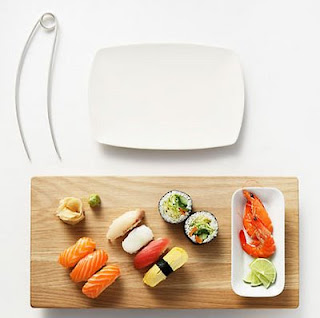
I grew up in the midwest, which didn't give me a lot of opportunity to learn or practice chopstick technique; this resulted in a rather steep learning curve once I moved to California and discovered that I love sushi. So maybe it's with folks like me in mind that Lincoln Kayiwa came up with the Tukaani - a bent-metal springy eating utensil reminiscent of a giant safety pin, but functionally more like chopsticks with training wheels. Is it really easier to use? Tough to say without trying, but it sure looks like it. And it's elegant enough - thanks to those gentle swooping curves, that it wouldn't be a complete embarassment to use, even in the company of chopstick masters.
[via David Report]

Mouse Hitches a Ride on your Laptop...

Those of us who like to use a mouse with our laptops do so at the cost of portability; when you add a mouse (and, God forbid, its cable) to the setup, suddenly you can't sling your laptop one-handed by your hip, lookin' all cool an' stuff. Instead, you're carrying the laptop flat and level, so the little rodent doesn't scurry off the edge, looking more like a nervous waiter with a tray of drinks. For better or worse, Logitech is trying a solution with its new v550 Nano Cordless Laser Mouse for Notebooks - the device comes with a tiny attach point to adhere to the back of your computer's screen, which lets the mouse hitch a ride when you go mobile. I'm not sure how I feel about adulterating the clean look of the back of my screen, and the riding mouse looks a bit like one of those fish that hangs out with sharks and cleans them and eats their scraps, but it might be worth it for the highly-mobile trackpad-hater. Hey, it's worth a shot!
[via Engadget]

Color-Coded Cutting Boards - A good idea with practical problems...

Color-coded cutting boards are out there in various incarnations, and they're certainly not a bad idea: use one color/logo (or in those pictured at left, both) per type of food that you don't want to mingle. Keeping your raw fish separate from your fresh veggies is a worthy goal! However, I've always found that in actual use, these boards just don't serve their purpose. And here's why: I don't know anyone who has enough cutting boards to be able to play by the color-coding rules all the time. It invariably ends up that, oh well, turns out you need to use the "fish-coded" board for chicken, and so it just happens in the craziness of the kitchen. And once that rule is broken, even once, it's tough to ever trust it again; it's back to good ol' memory (and looking at what appears to have been on a board) to determine whether it's good to use. Oh well...

Dog Doors - Finally, a perfect use for RFID!

Radio-Frequency Identification (RFID) has been "the wave of the future," at least to designers, for quite some time now. The problem is, that future seems annoyingly slow in coming - you know, along with stuff like flying cars and teleportation. Well, here's one application of RFID that's been deployed in a commercially available product, and put to excellent use. Plexidor dog doors use RFID tags on your dogs' collars to cue the door to open. Think of it like a garage door opener, but the pooch doesn't even have to push any buttons; the mere proximity of the RFID tag does the trick (ha). This keeps out strays, thieves, and the neighbor's darn dog, while allowing your dog to enjoy all the indecisiveness he or she needs regarding indoor/outdoor conundrum - which in turn allows you the happy pet owner to remain firmly planted on your rear. The future is here, and it is lazy!
[via Engadget]

iPhone (Finally!) - Same functions, just more fun...

Well, I finally did it - this weekend, I defied the lingering effects of the previous night's revelry, got up at 6:30am, and hit the Apple store for my very own iPhone 3G. (Along with my wife, brother-in-law, and sister-in-law!) I'm sure it will provide fodder for many future posts, but for now I'd like to take the overall gestalt, and I've found it to be this: most if not all of the iPhone's functionality can be found on other handsets. Internet, email, 3rd-party applications, location via GPS, music, video - all of these things can be done by quite a few phones out there. The difference is that the iPhone makes them easy - or heck, even fun! The most mundane actions, like setting an alarm clock, are simply delightful for their innovative and intuitive interfaces. Animations give the phone life, and it practically begs to be interacted with. And this is, in fact, a case of usability design: making functions so fun that they actually get used is indeed a service to the user. And so far, I'm certainly feeling well-served!

Not Useful, Just Fun: The Bubble Calendar!

This blog is supposedly about usable designs, and this one is anything but - but it's so much fun, I'll try not to feel bad about posting it. The Bubble Calendar is a big ol' sheet of bubblewrap on top of a calendar, giving you one, single, solitary pop per day. It's useless, really - you can't write anything useful on any of the days, and it's not all that easy to see at a glance whether or not a day has been popped. The only thing I can think of? By enforcing a daily limit of just that one pop, it may teach restraint - and an appreciation for delaying gratification.
[via Coolhunting and Gizmodo]

Self-Checkout Produce Scale with Image Recognition

I'm a big fan of self-checkout - or at least, the potential of self-checkout. It seems that in reality, the current systems are always just buggy enough to take more time than assisted checkout: the weight isn't what the scale expected ("unexpected item in bagging area"), the barcodes won't quite scan, or an associate has to be called over anyway to check ID for alcohol. But as the technological march continues onward, here's one barrier which is about to be busted - the scale in the photo is able to determine on its own, via image recognition, what kind of produce it's weighing. No more trying to identify it yourself ("what kind of tomato is that?"), or keying in a produce code number from a not-always-present sticker. Apparently, the image recognition even works through semi-transparent produce bags, is able to determine different types of the same fruit, and even at different stages of ripeness. All assuming, of course, that it actually works as intended - so if the current state of self-checkout machines is any indication, there's probably still a little way to go!
[via I4U, OhGizmo, and Gizmodo]

The Faucet Fountain - Good for a quick sip...

When there's no cup handy and I really need some hydration, I've never been one to shy away from slurping right from the faucet - but if there were another option available, I'd definitely take it! The Faucet Fountain is a neat little way to offer that option. Appropriately offered by Tiny Living, an outfit peddling efficient housewares for small spaces, it's an attachment for existing faucets which allows the user to flip the bottom and create a drinking-fountain-like stream. It's not the greatest-looking product out there, but it seems fairly useful and usable - and more feasible than the previously-posted Brush & Rinse!
[via The Kitchen and Gizmodo]

Simulating Fatigue in Video Games

As video games become more and more realistic, here's one area that has tended to be ignored: those darn characters never get tired! You can play for hours on end, and your soldier/alien/athlete/car-thief still runs around with the same vigor, like he's on some kind of super-drug. Well, the Near Future Laboratory has hacked Playstation controllers to add a realistic fatigue - the hack simply "dampens" the analog joystick movement, meaning that after time, pushing the stick all the way forward won't have the full effect it used to. It's an interesting concept to add this feature for realism, but even more interesting for the implications on long game-playing sessions - namely, they'll be less likely to happen! It's a built-in motivation to take a break from the game when your character gets tired. And, you know, maybe go outside and get some exercise...?
[via MAKE]

The Packaging Blues...

First of all, my apologies to regular readers for last week's unplanned hiatus - and this post attempts to address one of the many causes of it. As many of you know, I recently got married (that's my lovely wife Jessica in the photo) and moved - and both of those things include prodigious amounts of packaging. One of the important things that this experience has taught me is that there is good packaging (efficient, effective, easily unpacked), and bad packaging (the opposite of all those things). Wedding gifts tend to be among the worst offenders in the "bad packaging" category, mostly by being waaay overpackaged - that's Jess swimming in a sea of cardboard, packing paper, and bubble wrap, much of which was used to "protect," wait for it... those two pillows! We saw this trend over and over again - a huge box, containing packing paper and another box (the "gift-wrapped" one), containing yet more packing paper, bubble wrap, tissue paper, and then something tiny and basically indestructible like a lemon zester. The sheer volume of waste is staggering! It's easy to imagine the system that causes this, back at Crate and Barrel: a product is listed as having a certain size, and every product must be packed to [size + X], and if giftwrapped, [size + X + Y]. There just seems to be no provision in the system for how delicate a product is - for example, such a variable would prevent pillows from being redundantly wrapped in bubble wrap. That's the kind of "smart" packing that can save time, money, space, and the environment - and the kind of message that I would like to send a wedding gift recipient.