Credit Card Readers - Go with the flow...
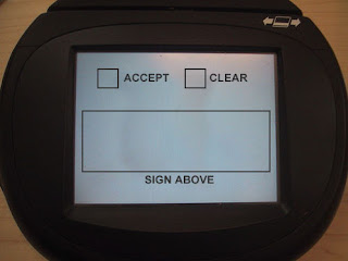
 Today we have a tip from my good friend Eva, who writes: "Dave, you HAVE to write a post about checkout credit card machines that put the damn 'ok or cancel' buttons BEFORE the signature box. Today was at least the fourth time I've cancelled a purchase accidentally because I clicked ok before I signed. ARRRGGH!" I mocked up her description into the image for this post, and I definitely identify with the experience (especially the arrrggh! part); these devices are certainly examples of technology pushing ahead without allowing good design to catch up. It should be common sense that the "flow" of an interface reades top-to-bottom and left-to-right (at least in Western cultures). And in this case, it doesn't even cost anything to get it right - you just have to think before you implement it! Getting it wrong, however, causes people to unintentionally cancel purchases, thereby slowing down the entire checkout line, not to mention the impact to their own sanity. There are plenty of other design problems with these devices, but one thing at a time - and this will certainly do for now!


3 comments:
But when you are not using a mouse, but instead have a pen in your hand, does the flow still start form up-left? It's an awkward place to start interacting with the machine, as your hand is completely obstructing you from seeing the screen (provided that you're right handed).
To make it clear, I'm only half serious with this comment. ;)
Niko, that's a very good point - I'd actually thought a bit about the hand-blocking-your-view issue when i wrote this post, but opted to leave it oversimplified instead of overcomplicated! So, half-serious sounds about right - I bet this is approximately a half-relevant issue!
These credit card reader devices are extremely outstanding.. Well it definitely makes some sense, designs are not at all the issues. It is up to the mark to work.
==================
eva
Credit Card Debt
Post a Comment