In a situation as generally germy as a bathroom, why have people touching more things than they need to and spreading microbes everywhere? That's the idea behind the freakishly anatomical but otherwise quite useful Foot Flush, a retrofit which allows your toilet to be flushed with a step on the pedal. It's a great idea, I just think it needs to be extended to more of the bathroom routine - so let's get the previously-posted foot-controlled faucets in there as well, and how about a pedal that controls the toilet seat, lifting it like a trashcan lid only when it's stepped on? Heck, hands could practically become obsolete!
[via MSN, DVICE, and Gizmodo]
Product design use and usability, designs new and old, inspired and unspired. The little things that matter.
"Unnecessary" Quotation Marks - Muddling the meaning...
Oh man, I love it: The "Blog" of "Unnecessary" Quotation Marks, besides being good for a few laughs, illustrates a real epidemic that seems to be sweeping over signmakers all over the country. Quotation marks have a meaning: to indicate that what's contained inside them is not to be taken at its literal meaning, or if so, only by the authority of a third-party source. Unfortunately, many signs use them simply for emphasis, as if bold, italic, underline, all caps, and different fonts aren't enough tools to do the trick. The problem for the viewer is that the real meaning of quotation marks is directly at odds with this misappropriated meaning. For example, is the viewer of this sign supposed to read that this is really reliable auto repair, or dubiously reliable auto repair? Given their careless use of the q-marks to intend the former, I'm forced to conclude that the latter is in fact true. Be sure to check the blog for some other hilariously inverted meanings, and lament the descent of the English language into an unintelligible mush...
[via Good Experience]
[via Good Experience]
FakeTV - Trick burglars into thinking you're home...
From a design perspective, there are three ways to deal with a burglar: (1) keep him out by force, which involves locks, deadbolts, and sometimes even bars on the windows; (2) keep yourself informed if he does break in, meaning installation of motion sensors, window-break sensors, and alarms going off if any of those are tripped, or (3) somehow make the home less desirable to the burglar in the first place. That last one is less obvious, though; what makes a home a less desirable target to a burglar? Well, since most don't actually want to encounter people during the break-in, the burglar would most likely move on from a seemingly-occupied home. That's where this product, the FakeTV, comes in - it simulates the light cast by a television, which is then intended to be seen by the burglar indirectly via the windows. It's a pretty smart alternative to leaving your real TV on, too - it simulates the fades, colors, and scene changes of a real TV accurately, but uses a tiny fraction of the electricity and is smart enough to turn on and off when appropriate. It may be a bit of an eyesore - but hey, so are bars on your windows! The only problem is if this product sells so well that it becomes a victim of its own success - burglars could wise up to it, and homeowners would have to move to the next step in the arms race...
[via Electronic House, Gearfuse, and Gizmodo]
[via Electronic House, Gearfuse, and Gizmodo]
Stirring Cup - Making users' habits effective...
Without a stirrer or spoon available, coffee or tea drinkers often resort to swishing the glass/cup/mug itself around and around, hoping to agitate whatever's not properly mixed. However, these glasses are all round, so there's not really any feature to shake things up - instead, you get "laminar flow," which is a fancy term for "nooo mixing." In this design, however, "some French students" (the most complete reference I can find for this one!) have taken the natural tendancy of users and made it effective - by adding a heavy ball in the bottom of a glass. When the user swishes the glass, the ball rolls around at a different rate than the liquid, busting up the laminar flow and mixing things up quite nicely. When a design takes a natural tendancy of the user and makes it work, well, that's about as good as it gets! Kudos to you, "some French students."
[via Dame de Comer & The Design Blog]
[via Dame de Comer & The Design Blog]
Ping Pong Door - Just for fun...
The Ping Pong Door from designer Tobias Fraenzel needs no explanation, so let's just skip straight to the analysis - rapid-fire!
-Useful? Sure. It's something fun, surprising, and delightful, packed into a space that's usually a boring ol' door.
-Usable? Eh, it ain't perfect. Any real table tennis players would be driven mad by the non-standard table size. And that "net?" Yikes.
-Fun? Totally.
[via Yanko & Make]
-Useful? Sure. It's something fun, surprising, and delightful, packed into a space that's usually a boring ol' door.
-Usable? Eh, it ain't perfect. Any real table tennis players would be driven mad by the non-standard table size. And that "net?" Yikes.
-Fun? Totally.
[via Yanko & Make]
Vagabond Executive Inn - Get your message straight!
"Branding" and "message" may be two concepts that don't have much to do with use and usability in product design, but they have something to do with it - without the right message to the user about what the product fundamentally is, users may not know how to approach the product, what to expect, or how it would fit their needs. On that subject, I'd like to present the peculiar creature that is the "Vagabond Executive Inn." Hmm. "Vagabond" is a chain of motels, and I think I know what to expect based on the name: the bare essentials for a wandering nomad, with the unfortunate added connotations of filth or general scuzziness. "Executive" is anything that caters to the (self-)important businessman, who demands service, convenience, and a bit of pampering. So what the heck can I expect at the Vagabond Executive? Sounds like something of an oxymoron to me - and with confused expectations surely come plenty of confused customers. This branding could have been better--and more-usably--designed!
Photo-Based To-Do List - Worth a thousand words...
Both Steve Rubel of Micro Persuasion and Stefano Castelvetri of Minddriven have discovered this technique for easily keeping a to-do list: simply use your phone to take a photo of the thing that needs to get done, and keep all those photos in a designated album on your phone. When you get it done, delete the photo. No messing with writing things out, wasting paper, or trying to sufficiently describe the item which may well be best captured in an image. It's useful, usable, and something that I expect to see more widely adopted as we all get used to these digital lives we're beginning to live!
[via Lifehacker]
[via Lifehacker]
Steve Jobs: "Design is how it works."
Trying to explain product design to people outside the industry can be difficult: the word "design" is something most people already associate with some specific kind of design - fashion and clothing design, interior design, graphic design, or aesthetic industrial design. Steve Jobs finds the same problem, and in 2003, clarified it in a New York Times Magazine interview:
"Most people make the mistake of thinking design is what it looks like. People think it’s this veneer — that the designers are handed this box and told, ‘Make it look good!’ That’s not what we think design is. It’s not just what it looks like and feels like. Design is how it works.”
Sing it, Steve! Amen, brother!
Spritzer Cup - Sacrificing dignity for comfort...
We've been going through a bit of a heat wave here in the bay area in the last few days - and that may be the only thing that makes this product look more desirable than ridiculous. Truth be told, though, the Spritzer Cup is not a bad idea - a mister built in to a water bottle, for spritzes in between sips, both ice-cold. (Just don't accidentally spray yourself with lemonade or soda!) It just looks... what's a nice way to say mind-numbingly stupid? Of course, it joins quite a few products I've covered on this blog which are mildly useful but crushingly ridiculous, like the Toaster Teapot, the SquidFace Pillow, and the all-time champion Ramen Fan. Still, as hot as it is outside... very tempting!
[via bookofjoe and Gizmodo]
[via bookofjoe and Gizmodo]
Foot Pedal Faucet Controls - Green & sanitary...
MetaEfficient reports on a green and sanitary trend that's just waiting to happen: foot-pedal controls for home faucets. As they point out, firstly, this method of controlling a faucet is sanitary: it prevents germs from being transferred via hand fixtures, which must be touched by dirty hands before washing and clean hands after washing. (This is why foot pedals are used in highly-hygeinic venues like hospitals and commercial kitchens.) But it also turns out that these things are green - by being able to control the flow with something other than your hands (with which you're busy working up a lather), you're more likely to let the faucet turn off while soaping, and resume it to rinse. MetaEfficient reports that this can account for savings of 7500 gallons of water annually for a single installation in the kitchen of a 4-person household. Like I said, a trend waiting to happen...
[via psfk]
[via psfk]
Tree Parking - When you *want* your bike in a tree...
Dismissing any memories I may have of frat punks putting peoples' bikes in trees as a prank, this concept from designer Abhinav Dapke is pretty brilliant: store bikes in the air, where they take up less real estate on the ground and are out of reach of thieves and vandals. He envisions Tree Parking being controlled by fingerprint-recognition, and presumably motorized to lift and lower the bike. Perhaps the most appealing benefit to this design is that bikers wouldn't have to lock their seats and both wheels along with the bike frame. What's up with that, by the way? Is there a black market for a la carte bike seats and wheels that I don't know about? Anyway, let's hope to see this move out of the concept stage and into reality!
[via Treehugger and Gizmodo]
[via Treehugger and Gizmodo]
Slim your wallet by putting cards on your phone...
Blogger Albert Alberts (yes, really) of 't Is Goud has come up with a neat trick for keeping his wallet svelte: stop physically carrying most of his membership cards, and instead keep high-resolution scans of them on his iPhone. He's even found that barcodes displayed on the phone's screen will scan successfully. This is a pretty ingenious little trick, especially if you keep your wallet in your back pocket and prefer to sit level on both buttcheeks! However, it's hopefully just a first step toward an eventual streamlining of the whole membership-card universe: I hope and expect that soon, memberships will be able to be associated with drivers' licenses, the SIM cards of mobile phones, fingerprints, RFID tags that may already exist in lots of our things, etc. When all that's needed is access, it's senseless to carry around an extra piece of clutter when we already have so much that it could be linked to!
[via Lifehacker]
[via Lifehacker]
Credit Card Readers - Go with the flow...
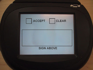
Today we have a tip from my good friend Eva, who writes: "Dave, you HAVE to write a post about checkout credit card machines that put the damn 'ok or cancel' buttons BEFORE the signature box. Today was at least the fourth time I've cancelled a purchase accidentally because I clicked ok before I signed. ARRRGGH!" I mocked up her description into the image for this post, and I definitely identify with the experience (especially the arrrggh! part); these devices are certainly examples of technology pushing ahead without allowing good design to catch up. It should be common sense that the "flow" of an interface reades top-to-bottom and left-to-right (at least in Western cultures). And in this case, it doesn't even cost anything to get it right - you just have to think before you implement it! Getting it wrong, however, causes people to unintentionally cancel purchases, thereby slowing down the entire checkout line, not to mention the impact to their own sanity. There are plenty of other design problems with these devices, but one thing at a time - and this will certainly do for now!
Pants in a Pinch - When you really need it, you'll be glad it's there...
My fiancee has assured me that I'll love eventually being a father, because of all the cool gadgets involved. I agree - and while this one lacks the slickness or glamor that some of those gadgets may boast, it certainly seems to fulfill an important function. Pants in a Pinch are exactly what they claim to be: pants, in a pinch. When the little excrement factory dispenses with a clean pair while away from home, these can be there for the rescue. It makes sense, at least to me - but I know that parenting is a very specialized user group, the members of which possess insights that I can't even imagine. That's how my similar admiration of the Pee-Pee TeePee was busted (check the comments on that post); will the same fate befall poor Pants in a Pinch? (Eva?)
[via productdose and Gizmodo]
[via productdose and Gizmodo]
Weight Loss Glasses - Bad ideas gone worse...
Just when you think everything has been tried in the weight-loss market, something like this comes along to torpedo your faith in human innovation. These Weight Loss Sunglasses are tinted blue, presumably making your food look so... blue... that it's just not appetizing. Yup, forget the fact that your eyes will adjust to the hue change, forget the fact that you can still smell the deliciousness, even forget the fact that you could just take the damn glasses off - this simple trick is supposed to help those unable to summon the willpower to abstain on their own to politely turn away grub? I don't think so. And they'll look either foolish or fashionable, depending on the eye of the beholder, while they're eating anyway. Bon appetit.
[via bookofjoe and Gizmodo]
[via bookofjoe and Gizmodo]
SquidFace Pillow - Face-down comfort, at a gawdy price...
As much as I hate to say it, this eyesore may actually be a useful product. The SquidFace Pillow exists only to solve a very specific, but universal problem - how to lie face-down without twisting your neck, but still be able to breathe. It's a problem masseuses have solved with expensive tables, but this is more efficient (and affordable) by being no more than what's needed to accomplish that function. That said, it's hideous - and sure to cause people to either laugh at you whilst you tan face-down on the beach, or think you're a dead body. Take your pick - but at least you can get a comfy face-down tan!
[via Nerd Approved and Gizmodo]
[via Nerd Approved and Gizmodo]
Plug It - USB cable masquerading as a lanyard...
If a design can take something you need and sneak it into something you already have, well, that's not a bad thing, is it? That seems to be the case with Plug It, where a USB adapter cable snaps together to become a lanyard or keychain. It'd be handy to have when you need a quick charge for your cellphone, download from your camera, or connection from whatever to whatever - and then it goes right back into hiding in plain sight. Industrial designers may prefer a flashy design that gets noticed, but product designers know when to pull a vanishing act...
[via Engadget]
[via Engadget]
Inflatable Sled Stretcher - Always ready, and a smoother ride...
The only thing not to like about this design is that it's not real - yet. The Firun, from designer Janine Zust on Yanko Design, is an inflatable sled stretcher designed to be carried on the backs of ski patrollers. By having the sled always available instead of having to request it from elsewhere, valuable minutes are saved in the rescue process. Also, the inflated sled acts as its own shock-absorption mechanism, protecting the injured passenger from further mountain-inflicted trauma. Get this on the slopes, stat!
[via Gizmodo]
[via Gizmodo]
Cameraphone Searching - Image recognition put to good use...
This is a product that's been a long time coming, in my opinion. The components have been there for a while - phones with internet connectivity, phones with built-in cameras, and more and more robust image-recognition software - so it was only a matter of time before image-based searching came to our cellphones. It's got a lot of promise - imagine being able to snap a quick photo of anything, literally anything, and get more info on that thing instantly. Find out more about landmarks, animals and plants, products in stores, sports teams and players, anything you can see! I'll be watching to see where this goes - for now, it's being pioneered in a system called ViPR by Evolution Robotics - and the demo shots in this post show just how robust the system can be, recognizing a book at any orientation and even partially obscured. Very exciting stuff!
[via MobileWhack and Gizmodo]
[via MobileWhack and Gizmodo]
Impromptu Seats - Neat, but needed?
Today's post concerns two very similar but totally unrelated designs for impromptu seating: on the top is designer Yanko designer Yong Rok Kim's Crutch Chair, and below is Jan Korbes' portable seat made from an old suitcase. Both concepts are slick enough to give any viewer an "oh, neat" reaction, but do they solve any problems? The Crutch Chair just might do that: crutch users, weary of supporting their weight with their armpits in a just-standing-around situation, may very well opt for this seat when no other is available. The design requires nothing extra to be carried around in order to gain this function, so the cost is nil. And as a bonus, it keeps the user at standing height so as to stay socially interactive with other standing people - because when there are no seats, which is when you need this product, everyone is standing, right? On the other hand, the suitcase seat fails most of these same tests of usability - it does require the user to carry an extra load, it doesn't solve a specific problem of the user (like those pained 'pits in the cruch user), and there's no real bonus to its function. It is, however, a neat case (pun intended) of up-cycling - but just neat, not quite usable!
[via Gizmodo and Make]
[via Gizmodo and Make]
A Better Jump-Rope - Old-school goes high-tech...
As manufacturers continue to feel the need to unnecessarily cram technology into every part of our lives, even the most classic of toys isn't safe from feature creep. But this time, it's actually something usable rather than just technology for technology's sake: from designer Jacky Wu on Yanko Design, this concept jump-rope uses LEDs embedded in the rope itself to display a running (er, jumping?) count in the air right in front of the user. It uses a technique called "persistence of vision," which allows a single moving line of LEDs to display a whole 2-dimensional display - pretty much as shown in the concept image at left. There have been jump-ropes with counters built in before, but the displays have been on the handles, where they're not visible until you tragically stop your record-attempting jumping streak just before you reach the threshhold. And counting in your head, well, that's just cruel. Here's to a genuine advance in the world of sidewalk sports!
[via Make]
[via Make]