More Upcycling - iPod packaging becomes speaker...

One of the most popular posts on this blog has been on "upcycling" - designs which reuse components in more valuable and sophisticated ways, rather than "downcycling" into progressively lower-quality uses on the way to the landfill. Well, here's another one! Through Gizmodo, this nifty little kit transforms the packaging for an iPod Nano into a teensy speaker set for the iPod. The idea is neat; the reality is a little more sobering. Who will actually use speakers of this quality (tiny speakers can't reach any bass) and low power (they're unpowered, so it'll be a whisper at best), other than to show off how eco-savvy they are? Ironically, once the novelty is over, the packaging and the speakers will end up in the landfill - a greater hit to ol' Mother Earth than if the packaging had been tossed in the first place. Just because an idea is buzzworthy and inspiring doesn't mean it's ready to follow through on its promise!

Kiss-and-Fly - More time for what matters...

While traveling to Minnesota for Thanksgiving, my fiancee noticed a new sign at the San Francisco airport: Kiss & Fly. Before even learning the details, I could tell this was a good bit of user-centric design: people like to take a little extra time to drop off loved ones, but the hustle and bustle of the main airport dropoff lanes don't take too kindly to that kind of lollygagging. Hence, the Kiss & Fly area, which is removed from the lanes that need to keep moving but provides passengers immediate access to trams or shuttles. It's just like another airport innovation from a few years back - the "cell phone waiting lot." And just like Kiss & Fly, it speaks for itself!

iPod Video Camera Dock - Doing it the hard way...

I've blogged about some design "bandaids" before - workarounds for design failures such as the snipped-headphone mute for laptops, or the actual-bandaid microphone wind guard. This one takes it a bit further, to an actual commercially-available product from Acme Research, which puts your iPod screen on your TV by shooting it with a video camera. Whether this is a necessary workaround intended for iPods for which video can't be output via cables, or whether this is the lazy/stupid/Rube-Goldberg way to remain ignorant of that function, I don't know. Either way it's something of an abomination - but at least good for a laugh! Bonus: you'll be broadcasting everything on your iPod screen - not just the content, but fingerprints, scratches, dirt, and grime. Enjoy the show!
[via Engadget]

Plant-Top Dish Drainer - Dishwater used down to the last drop...

A neat do-it-yourself design from Make Magazine, the Dish Drainer Project puts water from drying dishes to use in a potted plant. This reminiscent of the water conservation in the previously-posted toilet-top faucet, but let's face it, a little less off-putting. Besides, it's an excuse to get an additional potted plant in the home - which adds beauty, oxygen, and "good karma," for whatever that's worth. What's best about the design is that it doesn't even look too foreign to the plant itself - those spokes look enough like plant branches to fit in. Beauty and usability, plus conservation and household greenery... not bad!

Twist 'n Shot - Finally, Jello shots made less messy...

Jello shots may be delicious, but they're not the easiest things to shoot. That darn Jello just gets stuck in there, boldly defying gravity, depending on the will and dedication of the often-intoxicated consumer to liberate it. Enter one-trick-pony Twist 'n Shot, which adds an extra rotating part to peel the shot free from the glass walls and send it tumbling down your throat. I'm sure it works - but I've always thought that half the fun of a Jello shot was working it outta there, lips and tongue and stickiness and everything! Oh well...

List: Top 100 User-Centered Blogs

If you're interested in the kinds of subjects covered here at Unpressable Buttons, HTML.com has published a list of the Top 100 User-Centered Blogs that you might want to check out. HTML.com itself has mission statement (only dating back to August 2007) aiming to become "the authoritative resource online about retail virtual hosting plans." So, they're straying a bit from their core competence with this list - and "Top" lists are often a ploy to gain more visitor traffic. But, cynicism aside, it'd be nice to make it onto such a list next time around - not a bad goal, here...

Orkut: Lightweight champion for dialup-speed users...

Ready for some links? Here they come: Mark Hurst of the Good Experience blog and Bit Literacy book reports on a CNN story about social-networking underdog (at least in America) Orkut trouncing leaders MySpace and Facebook in certain markets like Brazil and India. (Whew!) So, why would this happen? Is it a cultural-style-and-taste thing, where maybe everyone doesn't like the obscene bells and whistles Americans tend to splash all over their pages? Nope, it's simpler than that - those exact bells and whistles make MySpace (especially) and Facebook (now that it's open to outside apps) much larger pages in terms of data. It turns out that Brazil and India have much lower average internet speeds - 15kbps, about what AOL users had in the US in 1990, according to the CNN article. Therefore, Facebook and MySpace take infuriating minutes to load a single page, while Orkut comes up relatively quickly.

Setting aside what comments I might make about the usability of too-highly-customizable webpages (and especially regarding the monstrosity that is MySpace, I'd have a lot!), it seems that an important lesson is this: usability doesn't just depend on the most appealing ideal design, but on making the right technologically-influenced decisions so a design can actually function in a non-ideal world. In this case, dropping some bells and whistles to make a faster-loading site seems to be a no-brainer for user satisfaction.

Some markets aren't looking for the best website in any category - they're looking for the lightweight champions!

Theft Foiler - OnStar slows down crooks...

Engadget reports a new feature coming to 2009 model-year cars with OnStar, called Stolen Vehicle Slowdown. Basically, a stolen car can be located with GPS - and once it's been tracked to within sight of the cops, OnStar can remotely cut the engine power, bring the car and its thief to a stop. No high-speed chases, just quick and in-your-face justice!

This anti-theft feature is reminiscent of the previously-blogged iAlertU for Mac laptops, which snaps a photo of a would-be thief in the act and emails it to a pre-set address. It's not just preventing theft, or recovering what was stolen - it's a "gotcha!" moment where the rightful owner gets a feeling of personal revenge over the thief. Products are designed to appeal to all kinds of emotions in consumers - but revenge is a fascinating one indeed!

Radiator Food Warmer - A case of perceived practicality...

There's something about the perceived practicality of a product which adds to its value - that is, if the user can easily rationalize the product in terms of saved space, saved energy, or any other "more for less" way, it'll be much more satisfying to use. This psychological effect can exist even if the perceived value doesn't really exist, or if it's offset by larger inconveniences.

With that prelude, check out the The Natural Wave, from designer Byung-seok You at Yanko Design via BoingBoing Gadgets. This ceramic plate is designed to fit on top of and use the heat from old-school steam radiators, in order to keep your hot drink and pastries toasty. Perceived to be practical and/or efficient? Definitely. Actually practical? Well, that depends on a lot of things: the shape of your particular radiator matching the fins on the underside of the Wave, the radiator actually being on a heating cycle when you're looking to use it, the radiator and atmospheric conditions interacting with the plate's thermal mass so that it's hopefully at the right temperature for use, and of course, where the radiator is located in your house or room. It's a lot of things to have to get just right - but when you do, I bet there's a wonderful perceived practicality and added value to the product!

Tongue Sucker - Simplicity when it's most needed...

If there's one area where simple ease of use should trump industrial design and bullet-point feature lists, it's emergency medical care. Thankfully, the Tongue Sucker fits the bill; even its name helps cut to the chase, telling you (the "untrained person" for whom it's designed) exactly what to with an admirable brevity. If that's not enough, the packaging helps with a clear illustration following the condition ("UNCONSCIOUS") under which it should be followed. Once it's been applied to an unconscious person, that person's tongue won't block his airway - an important step that can be overlooked by non-expercts in the panic of an emergency.

So, how about that? Good usability design can actually save lives!

Crazy Convergence, Part 3: The Gamerator!!!

I promised one more bit of crazy convergence, and if this doesn't deliver, I don't know what will! This, this, is a home arcade machine with a kegerator and beer tap built right in. Sure, the previous post about liquids and electronics was cautious, but the Gamerator clearly trumps fear with awesomeness.

So it turns out that sometimes, even though convergence might be crazy and not really rooted in logic, it can bring a smile to the face of even the most cynical consumer!

[via Engadget and Gizmodo]

Crazy Convergence, Part 2: Electronics and water...

In part 2 of our look at convergence, here's something a bit useful, but a bit unnerving as well: this is BevyTech's Gadget Bottle (via Engadget). It's a normal water bottle, except for the recess and strap intended to make room for and retain an electronic gadget of your choice. And you know what, this actually makes sense! When you're running or biking, these are two of the heavy, bulky items you likely want to have on you and readily accessible. Why not combine them to make one thing to carry instead of two? Of course, the answer is that never-happy duo of electronics and water. It's difficult to discard the vague notion that somehow, in this close proximity, the two are going to mix. I'm not really sure how... but somehow, it's bound to happen! So, this may be a very usable design - but fear can trump usability any day.

One more convergent contraption coming up next!

Crazy Convergence, Part 1: Mice that aren't...

"Convergence" is usually understood to be a good thing: combining features commonly used in similar situations into a single device, to increase convenience and efficiency. Cell phones and PDAs have finally converged into Treos, Blackberries, and iPhones; home printer/scanner/copiers have come together, too. But sometimes convergence can be taken too far - there's no real reason to actually combine the unhappily-mated products, and the result performs poorly in all of its functions.

Today, two computer mice definitely take convergence too far: these rodents were bred with calculators (Sanwa, via Gizmodo) and label printers (Casio, via Engadget), and the offspring ain't pretty. The calculator at least has a glimmer of reason - less distance to move your hand in order to make quick onscreen calculations - but the sacrifice in ergonomics (and accidental calculator keypresses?) more than obliterates it. And the label printer is simply ludicrous - there are better label printers, and better mice, and no reason to slap them together!

Come back next time for more of the good, the bad, and the ugly of convergence...

Perception vs Reality, and innocent bystander usability...

The abomination at left is a $199 PC soon to be sold at Walmart. The self-described geeks at Engadget claim that its innards are actually quite small, and can't by themselves justify the big honkin' case. So why make the overall box so voluminous? From Engadget: "Research indicates that Walmart shoppers equate the size of a system to its capability."

I suppose the tech-savvy set doesn't shop for PCs at Walmart, so this is at least understandable. It's just unfortunate that as perception is pandered to and reality ignored, usability is left by the wayside. A smaller computer scores better on many measures of usability: lower transportation costs and efforts, less packaging, a smaller footprint in the home, and less junk to chuck at the end of the product lifecycle. (Ironically and sadly, this computer is also marketed as a "green" machine.) But if perception can drive sales, it will continue to guide the product - and we all end up suffering just a bit from our ignorance.

Under-Cabinet Vacuum - So long, dustpans...

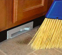
From Galaxie-Vac and via Gizmodo, the horribly-branded but very functional "Sweep-Away" vacuum installs inside a cabinet, with the... uh, "sucker" flush with the kitchen floor through a cutout in the baseboard. Just sweep your stuff to the vicinity of the vac, flick it on for a few seconds, and you're done. Very usable - especially if the power switch is exposed and kickable, as it seems to be. It sure beats trying to get those last few stubborn crumbs over the edge into the dustpan - doesn't it always seems like you get half the remaining crumbs with each sweep? The pile gets smaller and smaller, but never disappears...

iPod Deathclock: Upper or downer?

The iPod Deathclock is a website which, after inputting your iPod serial number and usage patterns, purports to use some fancy math to determine just how long your musical buddy will live. The accuracy of something like this is, from an engineering standpoint, probably horrible. But for a user, it's a date that will enter the mind and most likely never leave.

The question is whether this quantification of the iPod's mortality is a bummer or a pick-me-up. It could be a bummer because, hey, you just dropped hundreds of bucks on this thing, and it'll only last until then? On the other hand, it could be a date to look forward to, because on that date you'll have to upgrade to the shiniest new one on the market. The perception of the quality of the iPod itself is also affected, seeming either to be either a junky thing that doesn't last or one of an exciting series of products that will just keep improving.

So, what influences whether a user sees the glass half empty or half full? Is it related to income? Tech-savviness? Natural optimism or pessimism? Apple or Microsoft fan?? It'd be fascinating to know, but we probably never will...

Blind Spots - Car cameras made more useful...

There have been a few backup- and blindspot-cameras available for cars for a while now, but nothing has really caught on. But Nissan's Around View Monitor (via Gizmodo) might have what it takes for a more mainstream adoption - the innovation is that it synthesizes images from several cameras (top image) into a virtual above-car view (bottom image). It's almost immediately obvious how this could help in more ways than checking blind spots: making sure you can swing that u-turn, confirming you're centered in that parking spot, or helping with the always-daunting task of parallel parking. And if there's a dog somewhere in there, you'll catch that too!

Memo Pad Phone - One pro, many cons...

An industrial-design exercise from designer Arthur Se at Yanko Design (via Gizmodo), the Memo Pad Phone simply puts a memo pad around the keypad of a phone. Let's itemize the usability pros and cons for this one:

PRO: It puts a memo pad right where you might need it, if you're scrambling to get down some info on a hastily-answered call.

CON: Much of the writing space is virtually unusable, since writing in the upper and left areas would cause your hand to mash the keys, making a symphony--no, cacophony--of tones for your unfortunate listener.

CON: This makes the aforementioned unusable paper a nasty waste - very non-green!

CON: Just to nitpick, ID folks never seem to make phones look like phones. Especially the handset - if this thing were ringing, I might not know quite where to "pick it up!"

CON: ...And who uses landline phones like this anymore, anyway?

Looks like this one fails by a score of 4 to 1. But one good idea isn't bad!

Bathroom Reading - Hands-free probably a good idea...

Not that I'm the type to read in the restroom (ahem), but here's something that might make any such endeavor a bit more convenient and sanitary. After all, if reading materials are making the perilous trek to the toilet, it's best to keep them away from the lap. So, this wastebasket from Snowtone Design steps up to the task, with a simple cutout in the top. Of course, this also assumes that the user is temporarily relocating the wastebasket, for easy reading, for the duration of the restroom visit. So some handles on the side might be a nice touch as well - antibacterial-coated, please! [via Gizmodo]

Your Body as the Clicker - Gestural remote control...

Gizmodo reports that at JVC recently showed off a television which can be remote-controlled by hand gestures and claps. Just the basics - volume, channel, maybe mute or pause - all detected with a small camera and microphone. The implementation is important (if it's unreliable, the system could be infuriating), but the idea is fascinating from a usability point of view. No more searching for the remote, or even keeping it out all the time (they can be eyesores). On the other hand, control can now be shared among all viewers simultaneously, which is a brave new world in the home-theater milieu - will there be power struggles? Or will the original purpose of the remote control, the elimination of any physical effort whatsoever, win out and result in everyone being too lazy to life a finger...?