A brilliant suggestion from Parent Hacks (and through Lifehacker) is to add an extra curtain rod to your shower, on which to hang and dry the bathing suits and extra towels brought by summer swimmin'. The image at left is actually an overpriced "dual shower rod & towel rack," but an extra $10 rod from Walmart will do the trick just as well. It's not that this technique doesn't have its faults - after all, the drying items might get wet all over again anytime someone takes a shower - but it rates pretty highly for convenience.
So why isn't this seen in practice more often? Why isn't this the standard in homes, instead of a niche technique that needs to be discovered on a blog? It seems that this is a case of traditional, normal designs standing in the way of progress. A shower rod is understood, familiar, and has remained relatively unchanged for a century or more. No interior designer has ever earned the scorn of the client for sticking to the norm in this area. And so it stays the same, even when something more useful is out there - it's a cycle familiarity that's difficult to break. But, dare to break it, and there can be rewards in the form of a slightly easier, slightly more convenient life.
Product design use and usability, designs new and old, inspired and unspired. The little things that matter.
Magtable - The random-magazine experience?
From Satina Turner at Umbra, the Magtable Coffee Table certainly has that je-ne-sais-quois "neato" factor. Maybe it's just the clean, practical design. Maybe it's the efficient use of the space under the table. Maybe it's the notion that the mail-in cards will fall out of each magazine as it's inserted into the table, so they can be gotten rid of once and for all. Whatever it is, it's slick.
But one thing can't escape my mind about the actual use of this product, which could be viewed either as fault or feature. Unless the user subscribes exclusively to magazines thick enough to bear their titles on the spines, picking a magazine is going to be a random experience. Fine for the adventurous, but not for for those who don't like surprises. Either way, it doesn't put a bit of a dent in that "neato" quality!
Hourglass Nightlight: Form serving function...
From designer Sun-Young Lee on Yanko Design (and through Gizmodo), the Hourglass Worth of Light provides wonderful clarity of function to the user. There's no doubt in any user's mind that this baby will stay lit until the sand runs out, and no question that it'll then turn itself off. This is accomplished by calling iconic and well-understood forms to task (who doesn't recognize an hourglass?), rather than creating new instructions, controls, or displays for the purpose. The result is an immediately understood function - and no extra visual garbage. I haven't seen a better example of form serving function in quite a while!
LeechBlock: Oh, the tricks we play on ourselves...
It often seems that the Internet has ushered in an era of non-productivity which more than offsets the era of productivity for which it's been hailed. The culprits are those sites that leech our time away: the Facebooks, the ESPNs, the gossip sites, and the blogs (um, some blogs). How can we keep ourselves away from these leeches on our time? As is often the case in products or systems designed to curb undesirable behavior, a solution can be just to make that undesirable behavior less convenient. Enter LeechBlock, a Firefox extension by James Anderson which allows the user to block his own access to certain sites during certain times of the day. Of course, the user can always turn off this setting - he still actually has control over everything - but he appears to himself to be constrained by an outside entity. To actually return to the settings and remove the block would take conscious and premeditated action - not like the casual time-wasting into which it's so easy to slip on leech sites - and therefore force the user to admit weakness and defeat. And by golly, when that's the only other option, actually doing work starts to look a lot better!
Rotating Power Outlets - Score one more for wall warts...
In the never-ending, always-annoying battle between wall warts and electrical outlet space, a new entrant marks a small victory for the oversized socket hogs out there. From SmartHome (and through Gizmodo), the 360-Degree Rotating Outlet does exactly what its name says: just spin the sockets until your wall warts get along. Aside from sometimes being a fun little tetris-like puzzle, this is a nice solution. Certainly more elegant than the otherwise useful PowerSquid, but the cost is a more involved home installation. The only problem I can think of is the borderline-OCD resident of the home who just needs the sockets to be straight - and nothing to grab onto to spin an empty socket but the slots themselves. A dangerous combination...?
NosePouch: A little more function, a lot less class...
Sometimes a sneeze packs more of a punch than normal, and a regular hanky or Kleenex might let a bit of the, uh, "shrapnel" fly through the crease. Enter the NosePouch (via Gizmodo), whose makers are counting on that being enough of a problem to justify their product. A small extra flap catches any excess - and probably comfortably cradles the schnoz as well.
But for this small added functionality, there's a lot of baggage: from a usability standpoint, the eponymous pouch has to be properly oriented and aligned to do its job, and quick-acting sneezes aren't often that forgiving. Plus, the elegantly simple, versatile handkerchief must be traded in for a clunky one-trick pony. More than a conversation piece, something about this product begs to be an unfortunate punchline.
And one more thing - the website definitely doesn't help, with design seemingly inspired by late-night informercials and early-90's page layout. And the slogans: "The newest functional innovation in a handkerchief Since The Dark Ages!" "Say good-bye to embarrassing messy dishonorable discharge forever!" "Don't call it a handkerchief..."
...Don't call it mine, either!
Toaster Teapot: A good idea *in theory*...
...But a lot of things are good ideas in theory. Like communism. This one seems to make sense at first thought - tea and toast together! - but something about the execution is horribly, horribly wrong. It's the Toaster Teapot, from the Teapottery via Gizmodo.
So what makes this not work, exactly? Functionally, it probably works just fine. Is the problem with the industrial design, which looks like some unholy genetic experiment melding 60's-era teapots and toasters? Is it the unsettling combination of liquids and toasters, a question astutely observed by Gizmodo to be the province of "philosophers and coroners?" Is it maybe just the fact that tea and toast need not always be served together?
Or is it just one of those gut feelings, that this doesn't work? Maybe. Sometimes you just know it when you see it.
Blackout lights, where you need them...
A nighttime power outage can be a real inconvenience if you're not prepared - say, if you only have a flashlight in some faraway drawer, and you don't even know if the batteries are fresh. The Power-Failure Light (via Gizmodo), on the other hand, tries to make a blackout as much of a non-event as possible. By turning on automatically when power is lost, and providing light in the same places as when the power is on, the best-case scenario is that a user wouldn't even notice the change except for a slight dimming! It looks like the design has taken care of the other possible pitfalls: the light only comes on when the power goes out, not just when the light is turned off; it doesn't come on during daytime, as indicated by a photocell; and, the batteries charge themselves when the power is on, so they never need replacing. Overall, not bad - even if, from the looks of it, there won't be many lamps onto which this thing can fit! Oh well, can't win'em all...
'Pong in the Pool - Drinking games where they belong...
Yes. Yes, yes yes! Beerpong is a staple of college parties, but it comes with its share of pains in the butt: finding an appropriate space and table, finding the sobriety to properly rack the cup pyramids, finding that darn pingpong ball every time it misses the target and rolls under a couch, and of course, finding the motivation to clean up the whole mess the next day. Solving practically all of those problems, the PORTOPONG (via Gizmodo) provides an inflatable beerpong table in swimming pool. Built-in cupholders make perfect pyramids every time, the ball floats when a player misses the targets, and poolwater cleans everything (well enough, at least). The only things that are missing (and check out the comments below from the makers, these features will be in the production models!) are three additional cupholders on each side of the table: one on each side for the ball-cleaning (non-chlorinated) water, and two on each side for the players' non-game drinks. Hey, we can't all count on the other team's skills to get our fill, right?
Side-On Cutlery keeps it clean...
From designer Jens Martin Skibsted at Mater (and through Gizmodo), Side-On Cutlery keeps the business end of your eating utensils lofted above the table when set down. This is a useful design for both high-strung germaphobes (who want the cleanest utensils possible, no table germs, thanks) and garden-variety messy eaters (yours truly, for whom this design could avoid a few more stains on the tablecloth). The best part? This design doesn't even require proper "use" - it just works on its own. Unless the good ol' messy eater finds some way to mess it up!
Delayed Email Sending: A second chance we all need...
Sometimes a product's purpose is explicitly to correct for bizarre human foibles. In this case, there's something about the human mind that is incapable of spotting a horrific gaffe in an email until the second after the "send" button is pressed. It's like forgetting something when you're leaving on a trip: you don't remember it when you're doing your final check, you only remember it once you're in the car and just hit the road. It's the kind of thing that just gets you mad at yourself!
While I won't speculate about whatever psychological defect must be responsible for this, I can appreciate a designed which accommodates it. As pointed out by The How-To Geek (and through Lifehacker), Microsoft Outlook allows users to defer email delivery by any specified number of minutes after the "send" button is pressed. Just like the procrastinator's clock, this is merely a trick that a person decides to play on him/herself: there's no real difference between using this setting and merely waiting five minutes before pressing "send." But the trick works, the mind is fooled into betraying the errors it somehow knew it made - and a product's design is validated!
Integrated Tourniquets - Grim, but good...
From Blackhawk Products Group (and through Engadget) comes a useful, if somewhat morbid, design for combat wear: clothing with integrated tourniquets. Since time can mean the difference between injury and casualty when stopping blood loss after an incident, it can definitely help to already have the tourniquet where it's needed.
Not much more to say - it's one of those designs that can make a difference, and which regardless of one's politics, we can all hope finds its way to those who need it.
Procrastinator's Clock - A new twist on an old trick...
You probably know someone who uses the old trick of setting their clocks ahead a few minutes in order to never be late. It's a strange little technique which requires built-in denial: it only works if you choose to ignore what you actually know.
But here's a new twist - The Procrastinators Clock is an iGoogle gadget which "runs fast by up to 15 minutes... or does it?" That's right, its fast-setting is varied within the 15-minute range, so you never know how far ahead it is. Now that the dirty work is done without the user's knowledge, no ignorance need be forced or feigned. Wickedly wonderful - even if it may make a crap shoot out of your promptness!
Beaches as Products: Does banning work improve them?
Ahhh, beaches! Idyllic tropical beaches are usually thought of as locations, but in possibly more important ways, they're full-fledged products which (lucky us) can be subjected to the usual analytical drubbing provided here on Unpressable Buttons. They can be analyzed by their features (tree types, sea shells, available blanket area), performance (weather quality, water conditions), identity (family fun, secluded privacy), "sexiness" (uhhhh), and the combination and congruity of all of these things. Yup, they sound like products!
In that case, the latest "design" choice at some beaches is to ban the use of mobile productivity electronics - cell phones, PDAs, Blackberries, laptops, you get the picture. This makes the beach less convenient as a location - but much better as a product. At these beaches, your relaxation won't be interrupted by the nearby yuppie's conference call - or even by your own boss calling. A design choice to deny the user a convenience in order to preserve an ambiance is certainly gutsy - but in this case, I think, justified.
[No beaches were disturbed in the writing of this blog post.]
Transparent Toaster, one for the usability wishlist...
From the concept studio at Inventables (and through Engadget and ShinyShiny), the Transparent Toaster seems like a concept that's been begging to become reality for some time - at least from an end-user usability point of view. Of course, toasters in reality are price-locked commodities, and the "heating glass" upon which this concept depends is not yet capable of toasting bread. (And when it is, it'll surely catapult the resulting toaster into a very "unusable" price range.) But man oh man, talk about improving the current process (pop it up, check it out, pop it back down) of achieving the right shade of toast! Just glance over and check it - or heck, in something like this, watching toast toast might even be trance-inducingly satisfying. Beats watching paint dry...
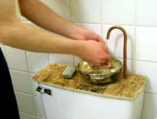
In-Home Water Recycling: The toilet-top faucet...
Presented as a do-it-yourself project on Instructables (and through LifeHacker), the toilet-top faucet and sink is a brilliant design to twice-use water in the home. The only catch is that it needs to be understood carefully to avoid the natural ickiness of a faucet and a toilet sharing water! Here's the deal:
-Fresh, clean water is dispensed from the faucet to wash your hands...
-Then, that water drains into the toilet tank (not the bowl), ready for the next time the toilet is flushed.
-When the toilet is flushed, the water you had used to wash your hands the previous time is used, along with however much more water was needed to fill the tank.
See? Your hands are not being washed with toilet water - your toilet is being flushed with handwater! As a bonus, some environmentally conscious chemical company could develop a handsoap that doubles as a toilet bowl sanitizer! Even so, good luck explaining the whole process to your guests...
Furniture for the Paranoid: "Safe Bedside Table"
From UK designer James McAdam, the Safe Bedside Table squeezes an interesting new function into small bedroom furniture - weapons for use against home intruders! A bit of under-table storage space seems to have been sacrificed for the cause, and say what you will about how it looks, but if you're the truly paranoid type the peace of mind may be worth it. The fact that this is a defensive weapon which is not a gun is a worthwhile decision, too - all evidence shows that having a gun in the home only increases the chance of violence, especially against friends and family. Besides, if the intruders in your neighborhood tend to be barbarians, old English infantries, or other combatants who tend to use swords, clubs, and shields rather than guns, this is perfect!
Another View: Design will *not* save the world...
I had mentioned the Q-Drum in a previous post as an example of design for third-world populations which reaches the hallowed "why didn't I think of that" status. But in a recent piece entitled "Why Design Won't Save the World," David Stairs argues that many so-called "appropriate" designs still suffer from a limited understanding of the real needs of these populations - including this very example. He explains:
"Designers are especially susceptible to [the delusion that technology can, more often than not, provide the solution], perhaps because they are trained to solve the immediate rather than long-term problems. By way of example, inventions like the ... Q-Drum water rollers work well at alleviating hard work over level ground, but are less effective than a jerrycan headload over meandering, hilly, narrow footpaths."
The article explores other examples and failings of many appropriate designs, and a pattern seems to be that these designs are more tailored to elicit praise from the design community itself than to truly solve the real and whole problems that exist in the field. This is an excellent point, overall - and one that I regret that this blog and its readers must beware! Your humble author is not in the intended field of use in many cases, does not witness the whole scenarios in which these products exist, and therefore often cannot distinguish when a design is merely buzzworthy or truly effective. Logical analysis is used as much as possible, of course, but even then there are limits.
Then again, I hope and believe that this kind of critical thought and analysis is the whole idea of this blog. Whether or not these things can all be figured out, if you're reading it, hopefully you're having fun trying it. Just like that Q-Drum can work in some situations and not as well in others, it's worth a try!
Marketing by Not Advertising
No-Ad sunblock has an interesting strategy for marketing itself, and it's built right into its name: it doesn't advertise, and (at least in theory) passes the savings along to the consumer. That's the part it can control; it also hopes that word of mouth will spread the word. So, are its hopes realistic? Let's look at how a user experiences this product:
-When purchasing sunblock, No-Ad is right there on the shelf alongside the name brands, and presumably costs the least. So far, so good...
-A critical juncture is right here: the consumer must consider sunblock a commodity, where sunblock is sunblock is sunblock, no real differences between them. So, special features and brand loyalty aside, No-Ad becomes the obvious choice.
-Now and for the rest of the product's use, the intended consumer feeling is the opposite of buyer's remorse: buyer's pride, for having saved some dough on a product that gets the job done.
-And hopefully, that pride makes it into conversation!
So, yes, it looks like they've got at least a plausible, "usable" business model here - and evidence confirms it, as they've been in business since 1960. Even better, it's not tricking the user - this one's really win-win. Here's to more of the same - and fewer ads everywhere!