Usable Reuse: Paper tubes for extension cords...

Two things that I'll wager eeeeverybody has are (1) an excess of extension cords or other long cables, and (2) paper towel and toilet paper tubes - and what a nice surprise that these omnipresent objects can be combined for some usable reuse! From Stephanie Winston's Best Organizing Tips (and via Unclutterer and Lifehacker), spare cables can be wrangled into much more manageable solid objects, rather than wiry messes, by those otherwise-discarded tubes. As far as I can tell, these beat almost every other solution for sheer usability - twist-ties, rubber bands, zip-ties, plastic bags, even tying the cables up in themselves. Brilliant, and reminiscent of some other improvised organization tricks...

Wine Double Pourer - Exactly one use, but a lot of wow factor...

Many products are valued for their versatility of use - and this one ain't that. This double wine pourer has exactly one purpose, to pour two (identical) glasses at the same time. From a usability standpoint, this borders on ridiculous - the time saved is on the order of a few seconds, and not in a time-critical situation. It's not applicable in any other situation, at all. However, in that one case for which it's perfect, its use adds a little something - a "cool factor" (or maybe "tool factor," but who's counting). There's something about having exactly the right thing for a niche situation, and being able to use it, that's undeniably satisfying for the user and anyone watching. It's that feeling of everything just falling right into place.
And then it can go back into hiding, waiting for the next time, if ever, when that perfect situation will come up again!
[via Bookofjoe and Gizmodo]

Crash Auto-Call - Great in real life, not in testing...

Some of the higher-end cars out there have systems which automatically call emergency services if the car crashes. This is a wonderful, life-saving design; it gets medical attention to the scene as quickly as possible, without having to rely on passers-by to call. However, you've gotta make sure these smart cars don't outsmart you (right?) - especially if you're the one who's making and testing the cars. To that end, Engadget reports that engineers in Germany failed to disable this feature before crash-testing a bunch of cars - which caused emergency teams to flock to the facility, believing it to be a massive pileup! Yeah, it's a funny one - but as products become increasingly complex and automated, designers, users, and especially non-conventional users (like testers) need to keep on top of all the roles they play and functions they perform. Otherwise, they just might, you know, take over the planet...

Breakfast Bike Tray - Convenience in the face of danger...

With a plethora of products out there designed to allow multitasking, at some point we users may have to draw our own line between efficiency and safety, rather than having it drawn for us. Here's one that may be right on that line - "Bikefast," the breakfast bike tray by Philipp Drexler. For the frequent urban bike commuter, this may be a great way to make the most of otherwise wasted time while stopped at intersections. But how do you resist the temptation to finagle a bite or a sip while in motion? What might happen to the food, the bike, or its rider, and is it worth the risk? Designs that enable bad "side" behaviors, even while providing good and valuable "main" functions, may be overall bad designs. Users just can't always be trusted to look out for their own best interests!
[via Wired, Dvice, and Gizmodo]

Post-it Pock-its - New twist on an old classic...

A concept from designers Pu Tai, Ayda Anlagan, and Paul Blease on Yanko Design, the Pock-it is a variation on the ubiquitous Post-its legendary for their versatile usability. Appropriately, this addresses one of the few functions that Post-its were never good at: holding something else up. The danger of original Post-its is that a user could imagine that they'd be able to perform this function, and may actually attempt it, but they just can't be trusted that way. Who knows how many fallen Post-its-plus-cargo have gone "missing" on the floor? And as a solution, Pock-its are designed well - dimensioned to hold business cards, credit cards, gift cards, or currency, and printed with an outline of the adhesive areas for orientation and an instant understanding of the function. The adhesive even stops short of the top, so an edge can be easily peeled from a pad of these things. 3M, are you listening...?
[via Gizmodo]

Netflix Mailers - Usability, good looks, or machinability?

The AP reports that Netflix's DVD-mailing envelopes design has been causing problems for the U.S. Postal Service; specifically, that "non-machinable" aspects of the mailers have resulted in the frequent need to manually handle them at a much higher cost. That's the kind of cost that comes back to the consumer eventually, either through Netflix fees or postage rates. So this design seems to need to find a sweet spot, in between high usability, good looks, and machinability. They're already very usable - the same envelope is used to mail movies out and back, with peel-off adhesive and tear-off conversion. And the current look of the mailers is very much part of their branding, saturated red with white and black accents. I don't know what needs to change to make them more machinable, but here's hoping it's a mere aesthetic change - or that the usability will be impacted little if any. In any case, this example demonstrates how products often have to deal with other factors outside of the frequent areas of aesthetics and usability - and how usability might easily be drowned out by the others if it doesn't have a good advocate on the case!

Mapquest's Gas Cost Calculator - The real cost of your trip...

Lifehacker reports that MaqQuest has added a gas price calculator to its mapping site. It's interesting that this feature seems to have been missing from mapping sites - routes can be adjusted, traffic severity and patterns can be included, and time estimates are accurate down to the minute, but gas cost hasn't been an available (or at least not a prominent) metric. After all, the monetary cost of a trip may influence a user's calculation about whether to take the trip at all - if the choice is to drive farther to find a better price on a purchase, for example, this may help the user discover that the nearer, higher price is actually a lower total cost. Or even make the purchase online, eliminating another car on the road and reducing the carbon footprint of the purchase. Not bad, for just a little more info made available to users!

Static Electricity Eliminator - No more dreading the shock...

It's winter, and static electricity is all over the place. For lots of us, there are times and places where we know that a nasty little shock is waiting for us - that one door handle, car door, desk chair, or mailbox, that just always gets ya. And when that's the case, you dread it - it's just a little shock, but you can't bring yourself to just reach out and touch it. We'd all be better off if we didn't have to play mind games with inanimate objects and the laws of physics.

Enter the Static Electricity Eliminator, which does exactly what you'd think. It fits on a keychain, so users can have it when they need it; the tip is rubber, so it won't scratch whatever you're grounding; and it even gives you positive feedback when you've grounded yourself (read: when you've dodged a shock). If that doesn't give you a good feeling, I don't know what will!
[via Gizmodo and Coolest Gadgets]

Popcorn Forks - Useful? Ridiculous? Can't decide.

We've seen some intersections between usability and ridiculousness before (Ramen Fan, anyone?), but this one balances particularly well on that line. The Popcorn Fork does what you'd expect it to, keeping your hands out of the popcorn and the popcorn off of your hands. It also stores salt in the base, the icing on the cake... er, salt on the popcorn. But aside from that last, totally unnecessary feature, the core functionality may actually be useful. Keeping the bowl sanitary is in everyone's best interest, especially if the movie is a tearjerker and extra mucus is flowing everywhere. And personally, I've always had to wash my hands after grubbing on some extra-buttery goodness, which requires an interruption of the movie. These could actually give the user a better movie experience! Especially if the home theater is dimly lit, so nobody will see just how ridiculous they look...
[via Gizmodo and Shiny Shiny]

Outgoing Voicemail Messages - Products we design for each other...

Designers or not, we all end up designing "products" that will be used by other people. Outgoing voicemail messages are a perfect example; are we thinking of the "user" (the caller) when we decide what to say? In most cases, no - we just repeat the same litany of time-wasting, useless info we're used to hearing when we get other peoples' outgoing messages. The Cranking Widgets Blog has come up with some instructions for how to make your outgoing message more user-friendly - things like "don't tell me to leave a message," "don't tell me you're unavailable," and "don't tell me you'll return my call as soon as you can," all of which are obvious if a message is being recorded in the first place. Also on the list: do say if you'll be gone for a predetermined time; don't tell me to email you (the caller is probably phoning rather than emailing on purpose!); and of course, "Don't. Play. Music."

Overall I'm a fan of these guidelines. But there's one exception - if a normal outgoing message is full of useless time-wasting information, that time can be used by the callers to mentally compose their messages. Which may mean more efficient, coherent messages left on your machine... which may be more user-friendly to you!

Magazine/Cameraphone Ad - "Cross-platform" usability...

This is a photo of an ad I encountered in the print edition of Newsweek recently, where the reader is encouraged to recruit good volunteers for Big Brothers / Big Sisters by (1) taking a cameraphone photo of the orange square on the page, and (2) sending that image to a friend who'd fit the role well. Besides rating high on the "cute" factor (note the aiming aids to the left and right of the target area, and the reminder to adjust your zoom), this is actually an ingenious usability idea by the advertiser. Most magazine ads require a reader to cross platforms - that is, they have to remember (or clip) something from the printed magazine, and then either make a phone call or look up a website. This design enables the reader to leap nimbly from the magazine to the sent photo message, without having to remember anything, or even cobble together a unique message to the friend. That lowered barrier could definitely make a difference in the number of people who go through with the whole routine!

The next step: smartphones which can identify the "bbbs.org" URL in the photo, and make that portion of the image a clickable link. Technology can do it, if designers can just think of it!

Umbrella Water Gun - Fun in the rain...

Why let all that water just roll off the side of your umbrella and go to waste? Why not have some fun with it? Alex Woolley has figured out how to make adults play in the rain: an umbrella with a funnel-shaped top which guides water through the pole and into a water gun. With a few good shots, your adversary may as well have never brought an umbrella in the first place!

Gas Pumps with Google Maps - Get directions, keep your pride...

Good user-centered design puts what people need when and where they need it. Great user-centered design lets them feel good about using it. In this case, drivers (ahem, men?) who are lost and too proud to stop for directions can stop for gas and, hey, just happen to get directions! Engadget reports that Google Maps will soon be available on certain internet-enabled gas pumps - free, supported by coupons that print out along with maps and directions. It's not admitting weakness because it's part of another task. That kind of denial often is a valuable part of self-image - and one that a great design will take into account.

RedesignMe.org - Make your voice heard...

ReDesignme.org is a new site which allows anyone to upload design gripes - that frustrating cellphone, that confusing bunch of buttons, that flimsy POS product - to be "redesigned" by other visitors to the site. It's a neat idea, even if most of the problems are very simple and the solutions straightforward - but then, the posts on this site sometimes fall into that category too! Check it out, and see if there are any design problem's you'd solve in an interesting way. Oh, and resist the urge to submit the site itself as a problematic design...

More Upcycling - iPod packaging becomes speaker...

One of the most popular posts on this blog has been on "upcycling" - designs which reuse components in more valuable and sophisticated ways, rather than "downcycling" into progressively lower-quality uses on the way to the landfill. Well, here's another one! Through Gizmodo, this nifty little kit transforms the packaging for an iPod Nano into a teensy speaker set for the iPod. The idea is neat; the reality is a little more sobering. Who will actually use speakers of this quality (tiny speakers can't reach any bass) and low power (they're unpowered, so it'll be a whisper at best), other than to show off how eco-savvy they are? Ironically, once the novelty is over, the packaging and the speakers will end up in the landfill - a greater hit to ol' Mother Earth than if the packaging had been tossed in the first place. Just because an idea is buzzworthy and inspiring doesn't mean it's ready to follow through on its promise!

Kiss-and-Fly - More time for what matters...

While traveling to Minnesota for Thanksgiving, my fiancee noticed a new sign at the San Francisco airport: Kiss & Fly. Before even learning the details, I could tell this was a good bit of user-centric design: people like to take a little extra time to drop off loved ones, but the hustle and bustle of the main airport dropoff lanes don't take too kindly to that kind of lollygagging. Hence, the Kiss & Fly area, which is removed from the lanes that need to keep moving but provides passengers immediate access to trams or shuttles. It's just like another airport innovation from a few years back - the "cell phone waiting lot." And just like Kiss & Fly, it speaks for itself!

iPod Video Camera Dock - Doing it the hard way...

I've blogged about some design "bandaids" before - workarounds for design failures such as the snipped-headphone mute for laptops, or the actual-bandaid microphone wind guard. This one takes it a bit further, to an actual commercially-available product from Acme Research, which puts your iPod screen on your TV by shooting it with a video camera. Whether this is a necessary workaround intended for iPods for which video can't be output via cables, or whether this is the lazy/stupid/Rube-Goldberg way to remain ignorant of that function, I don't know. Either way it's something of an abomination - but at least good for a laugh! Bonus: you'll be broadcasting everything on your iPod screen - not just the content, but fingerprints, scratches, dirt, and grime. Enjoy the show!
[via Engadget]

Plant-Top Dish Drainer - Dishwater used down to the last drop...

A neat do-it-yourself design from Make Magazine, the Dish Drainer Project puts water from drying dishes to use in a potted plant. This reminiscent of the water conservation in the previously-posted toilet-top faucet, but let's face it, a little less off-putting. Besides, it's an excuse to get an additional potted plant in the home - which adds beauty, oxygen, and "good karma," for whatever that's worth. What's best about the design is that it doesn't even look too foreign to the plant itself - those spokes look enough like plant branches to fit in. Beauty and usability, plus conservation and household greenery... not bad!

Twist 'n Shot - Finally, Jello shots made less messy...

Jello shots may be delicious, but they're not the easiest things to shoot. That darn Jello just gets stuck in there, boldly defying gravity, depending on the will and dedication of the often-intoxicated consumer to liberate it. Enter one-trick-pony Twist 'n Shot, which adds an extra rotating part to peel the shot free from the glass walls and send it tumbling down your throat. I'm sure it works - but I've always thought that half the fun of a Jello shot was working it outta there, lips and tongue and stickiness and everything! Oh well...

List: Top 100 User-Centered Blogs

If you're interested in the kinds of subjects covered here at Unpressable Buttons, HTML.com has published a list of the Top 100 User-Centered Blogs that you might want to check out. HTML.com itself has mission statement (only dating back to August 2007) aiming to become "the authoritative resource online about retail virtual hosting plans." So, they're straying a bit from their core competence with this list - and "Top" lists are often a ploy to gain more visitor traffic. But, cynicism aside, it'd be nice to make it onto such a list next time around - not a bad goal, here...

Orkut: Lightweight champion for dialup-speed users...

Ready for some links? Here they come: Mark Hurst of the Good Experience blog and Bit Literacy book reports on a CNN story about social-networking underdog (at least in America) Orkut trouncing leaders MySpace and Facebook in certain markets like Brazil and India. (Whew!) So, why would this happen? Is it a cultural-style-and-taste thing, where maybe everyone doesn't like the obscene bells and whistles Americans tend to splash all over their pages? Nope, it's simpler than that - those exact bells and whistles make MySpace (especially) and Facebook (now that it's open to outside apps) much larger pages in terms of data. It turns out that Brazil and India have much lower average internet speeds - 15kbps, about what AOL users had in the US in 1990, according to the CNN article. Therefore, Facebook and MySpace take infuriating minutes to load a single page, while Orkut comes up relatively quickly.

Setting aside what comments I might make about the usability of too-highly-customizable webpages (and especially regarding the monstrosity that is MySpace, I'd have a lot!), it seems that an important lesson is this: usability doesn't just depend on the most appealing ideal design, but on making the right technologically-influenced decisions so a design can actually function in a non-ideal world. In this case, dropping some bells and whistles to make a faster-loading site seems to be a no-brainer for user satisfaction.

Some markets aren't looking for the best website in any category - they're looking for the lightweight champions!

Theft Foiler - OnStar slows down crooks...

Engadget reports a new feature coming to 2009 model-year cars with OnStar, called Stolen Vehicle Slowdown. Basically, a stolen car can be located with GPS - and once it's been tracked to within sight of the cops, OnStar can remotely cut the engine power, bring the car and its thief to a stop. No high-speed chases, just quick and in-your-face justice!

This anti-theft feature is reminiscent of the previously-blogged iAlertU for Mac laptops, which snaps a photo of a would-be thief in the act and emails it to a pre-set address. It's not just preventing theft, or recovering what was stolen - it's a "gotcha!" moment where the rightful owner gets a feeling of personal revenge over the thief. Products are designed to appeal to all kinds of emotions in consumers - but revenge is a fascinating one indeed!

Radiator Food Warmer - A case of perceived practicality...

There's something about the perceived practicality of a product which adds to its value - that is, if the user can easily rationalize the product in terms of saved space, saved energy, or any other "more for less" way, it'll be much more satisfying to use. This psychological effect can exist even if the perceived value doesn't really exist, or if it's offset by larger inconveniences.

With that prelude, check out the The Natural Wave, from designer Byung-seok You at Yanko Design via BoingBoing Gadgets. This ceramic plate is designed to fit on top of and use the heat from old-school steam radiators, in order to keep your hot drink and pastries toasty. Perceived to be practical and/or efficient? Definitely. Actually practical? Well, that depends on a lot of things: the shape of your particular radiator matching the fins on the underside of the Wave, the radiator actually being on a heating cycle when you're looking to use it, the radiator and atmospheric conditions interacting with the plate's thermal mass so that it's hopefully at the right temperature for use, and of course, where the radiator is located in your house or room. It's a lot of things to have to get just right - but when you do, I bet there's a wonderful perceived practicality and added value to the product!

Tongue Sucker - Simplicity when it's most needed...

If there's one area where simple ease of use should trump industrial design and bullet-point feature lists, it's emergency medical care. Thankfully, the Tongue Sucker fits the bill; even its name helps cut to the chase, telling you (the "untrained person" for whom it's designed) exactly what to with an admirable brevity. If that's not enough, the packaging helps with a clear illustration following the condition ("UNCONSCIOUS") under which it should be followed. Once it's been applied to an unconscious person, that person's tongue won't block his airway - an important step that can be overlooked by non-expercts in the panic of an emergency.

So, how about that? Good usability design can actually save lives!

Crazy Convergence, Part 3: The Gamerator!!!

I promised one more bit of crazy convergence, and if this doesn't deliver, I don't know what will! This, this, is a home arcade machine with a kegerator and beer tap built right in. Sure, the previous post about liquids and electronics was cautious, but the Gamerator clearly trumps fear with awesomeness.

So it turns out that sometimes, even though convergence might be crazy and not really rooted in logic, it can bring a smile to the face of even the most cynical consumer!

[via Engadget and Gizmodo]

Crazy Convergence, Part 2: Electronics and water...

In part 2 of our look at convergence, here's something a bit useful, but a bit unnerving as well: this is BevyTech's Gadget Bottle (via Engadget). It's a normal water bottle, except for the recess and strap intended to make room for and retain an electronic gadget of your choice. And you know what, this actually makes sense! When you're running or biking, these are two of the heavy, bulky items you likely want to have on you and readily accessible. Why not combine them to make one thing to carry instead of two? Of course, the answer is that never-happy duo of electronics and water. It's difficult to discard the vague notion that somehow, in this close proximity, the two are going to mix. I'm not really sure how... but somehow, it's bound to happen! So, this may be a very usable design - but fear can trump usability any day.

One more convergent contraption coming up next!

Crazy Convergence, Part 1: Mice that aren't...

"Convergence" is usually understood to be a good thing: combining features commonly used in similar situations into a single device, to increase convenience and efficiency. Cell phones and PDAs have finally converged into Treos, Blackberries, and iPhones; home printer/scanner/copiers have come together, too. But sometimes convergence can be taken too far - there's no real reason to actually combine the unhappily-mated products, and the result performs poorly in all of its functions.

Today, two computer mice definitely take convergence too far: these rodents were bred with calculators (Sanwa, via Gizmodo) and label printers (Casio, via Engadget), and the offspring ain't pretty. The calculator at least has a glimmer of reason - less distance to move your hand in order to make quick onscreen calculations - but the sacrifice in ergonomics (and accidental calculator keypresses?) more than obliterates it. And the label printer is simply ludicrous - there are better label printers, and better mice, and no reason to slap them together!

Come back next time for more of the good, the bad, and the ugly of convergence...

Perception vs Reality, and innocent bystander usability...

The abomination at left is a $199 PC soon to be sold at Walmart. The self-described geeks at Engadget claim that its innards are actually quite small, and can't by themselves justify the big honkin' case. So why make the overall box so voluminous? From Engadget: "Research indicates that Walmart shoppers equate the size of a system to its capability."

I suppose the tech-savvy set doesn't shop for PCs at Walmart, so this is at least understandable. It's just unfortunate that as perception is pandered to and reality ignored, usability is left by the wayside. A smaller computer scores better on many measures of usability: lower transportation costs and efforts, less packaging, a smaller footprint in the home, and less junk to chuck at the end of the product lifecycle. (Ironically and sadly, this computer is also marketed as a "green" machine.) But if perception can drive sales, it will continue to guide the product - and we all end up suffering just a bit from our ignorance.

Under-Cabinet Vacuum - So long, dustpans...

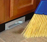
From Galaxie-Vac and via Gizmodo, the horribly-branded but very functional "Sweep-Away" vacuum installs inside a cabinet, with the... uh, "sucker" flush with the kitchen floor through a cutout in the baseboard. Just sweep your stuff to the vicinity of the vac, flick it on for a few seconds, and you're done. Very usable - especially if the power switch is exposed and kickable, as it seems to be. It sure beats trying to get those last few stubborn crumbs over the edge into the dustpan - doesn't it always seems like you get half the remaining crumbs with each sweep? The pile gets smaller and smaller, but never disappears...

iPod Deathclock: Upper or downer?

The iPod Deathclock is a website which, after inputting your iPod serial number and usage patterns, purports to use some fancy math to determine just how long your musical buddy will live. The accuracy of something like this is, from an engineering standpoint, probably horrible. But for a user, it's a date that will enter the mind and most likely never leave.

The question is whether this quantification of the iPod's mortality is a bummer or a pick-me-up. It could be a bummer because, hey, you just dropped hundreds of bucks on this thing, and it'll only last until then? On the other hand, it could be a date to look forward to, because on that date you'll have to upgrade to the shiniest new one on the market. The perception of the quality of the iPod itself is also affected, seeming either to be either a junky thing that doesn't last or one of an exciting series of products that will just keep improving.

So, what influences whether a user sees the glass half empty or half full? Is it related to income? Tech-savviness? Natural optimism or pessimism? Apple or Microsoft fan?? It'd be fascinating to know, but we probably never will...

Blind Spots - Car cameras made more useful...

There have been a few backup- and blindspot-cameras available for cars for a while now, but nothing has really caught on. But Nissan's Around View Monitor (via Gizmodo) might have what it takes for a more mainstream adoption - the innovation is that it synthesizes images from several cameras (top image) into a virtual above-car view (bottom image). It's almost immediately obvious how this could help in more ways than checking blind spots: making sure you can swing that u-turn, confirming you're centered in that parking spot, or helping with the always-daunting task of parallel parking. And if there's a dog somewhere in there, you'll catch that too!

Memo Pad Phone - One pro, many cons...

An industrial-design exercise from designer Arthur Se at Yanko Design (via Gizmodo), the Memo Pad Phone simply puts a memo pad around the keypad of a phone. Let's itemize the usability pros and cons for this one:

PRO: It puts a memo pad right where you might need it, if you're scrambling to get down some info on a hastily-answered call.

CON: Much of the writing space is virtually unusable, since writing in the upper and left areas would cause your hand to mash the keys, making a symphony--no, cacophony--of tones for your unfortunate listener.

CON: This makes the aforementioned unusable paper a nasty waste - very non-green!

CON: Just to nitpick, ID folks never seem to make phones look like phones. Especially the handset - if this thing were ringing, I might not know quite where to "pick it up!"

CON: ...And who uses landline phones like this anymore, anyway?

Looks like this one fails by a score of 4 to 1. But one good idea isn't bad!

Bathroom Reading - Hands-free probably a good idea...

Not that I'm the type to read in the restroom (ahem), but here's something that might make any such endeavor a bit more convenient and sanitary. After all, if reading materials are making the perilous trek to the toilet, it's best to keep them away from the lap. So, this wastebasket from Snowtone Design steps up to the task, with a simple cutout in the top. Of course, this also assumes that the user is temporarily relocating the wastebasket, for easy reading, for the duration of the restroom visit. So some handles on the side might be a nice touch as well - antibacterial-coated, please! [via Gizmodo]

Your Body as the Clicker - Gestural remote control...

Gizmodo reports that at JVC recently showed off a television which can be remote-controlled by hand gestures and claps. Just the basics - volume, channel, maybe mute or pause - all detected with a small camera and microphone. The implementation is important (if it's unreliable, the system could be infuriating), but the idea is fascinating from a usability point of view. No more searching for the remote, or even keeping it out all the time (they can be eyesores). On the other hand, control can now be shared among all viewers simultaneously, which is a brave new world in the home-theater milieu - will there be power struggles? Or will the original purpose of the remote control, the elimination of any physical effort whatsoever, win out and result in everyone being too lazy to life a finger...?

Apple Stores' Buttonless Elevators

Here we have another literally unpressable button - this time, it's unpressable because... it doesn't exist. Apparently, multi-story Apple Stores have elevators with no buttons at all - they simply go up and down, stopping at every floor. This certainly helps accomplish a clean visual design, and is a bold battle won in Steve Jobs' war against buttons.

But what does it do for usability? It could be frustrating, since the user will start by looking for a button that will never be found. Then once the reality is understood, it may take a bit longer to get where you're going than in a button-studded version. But, Apple Stores are places to browse and explore in the first place - something which is in the interest of both the consumer and the retailer. If you stop on a floor you never would have discovered otherwise, and end up finding something you like... well, this no-button thing might not be such a pain after all.

Cereal Bowl Features Slow-Release Milk

There were some people who objected to a previously-posted baking pan design promising all-edge brownies - okay, that's fair, some folks like the center ones. But who likes soggy cereal?? Didn't think so. That's why I expect this design, the EatMeCrunchy cereal bowl, will be a bit more popular. A separate chamber keeps the milk away from the cereal except for a small "mixing area," so you just soak a biteful at a time. Very, very, very nice. [via Gizmodo]

Phone Fingers - Shameless opportunism made even uglier...

The iPhone is a hot product these days, no doubt about it. So what's the best way to obliterate the cool-cred gained by having the sweetest pocket rig on the market? Phone Fingers should do it. Basically, small condoms for your digits (yes, you even "unroll" them onto your unlucky fingers), these supposedly prevent fingerprints and smudges from accumulating on your iPhone screen. Hmm. Here are the first of maaany problems I can see:

1. Smudging isn't that much of a problem on the iPhone - it's something that had been worried about prior to its release, but which turned out to really be a non-issue.

2. Latex will tend to have a "grippy" friction against the iPhone's screen, which will impede important interactions such as sliding, scrolling, dragging, and pinching.

3. The product defeats itself: it exists to keep your iPhone looking good, but in fact only makes you, your iPhone, and everything it touches horribly, painfully uncool.

So, why do these things even exist? It's shameless opportunism, riding on the hype of a true phenomenon: if it says "iPhone," these days somebody is gonna buy it!

Uglification to Deter Theft: Functional, but less satisfying?

Make Magazine has an interesting method to deter bike theft: uglify it! They offer step-by-step instructions for how to make a bike look decrepit but still work like new.

But here's where we witness the blurred line between form and function: though it make work fine in every functional way, an ugly bike just isn't as satisfying. You can't show it off; you don't get that "wow" feeling when you yourself look at it. Much like the previously-posted scratched putter, it messes with your mood and your overall state of mind. Sure, it won't get stolen - but it might not steal your heart anymore, either!

Nose-Notched Wine Glasses - Underdelivering on hype...

Sometimes a small design feature masquerades as a World-Changing Innovation - and I think we've got a case of such a delusion of grandeur in Silhouette wine glasses (via Gizmodo). A simple recess in the rim of the glass allows the oenophilic schnoz to get closer to the wine - and yeah, that's about it. Is this a problem in need of a solution, or a solution searching desperately for a problem? My money's on the latter.

And speaking of money, $54 per glass? No doubt another case of the product trying to bill itself as high-end. (Of course, the "regular" price is $78... sheesh.) Finally, check out the website URL; I'm afraid it's a stretch to claim that a nose-notch makes this the "greatestwineglass.com" of all...

"Photoshoot In Progress" - Making the best of it...

Passing the Restoration Hardware store in Palo Alto a few weeks back, I noticed this sign. Pretty simple, but also fairly ingenious - and here's why:

The store has to be closed for the photoshoot, that's a given. A basic sign would just inform potential customer that the store is "temporarily closed" - leaving them disappointed, even frustrated. But this sign actually adds value by pointing out that "this location has been selected as a model," and to "enjoy the preview" of how all stores will look for the upcoming season! Magically, those potential customers no longer feel inconvenienced - they feel lucky to have access to such a special Restoration Hardware location. And if the sign has really done its job, they can't wait to come back...

Mouse Cursors and Text - How the tiniest things matter...

The very smallest details of a user's experience can add up to make a significant difference in the effectiveness of (or satisfaction with) any product. Here, we'll look at the eensy weensy issue of the mouse cursor while typing. In many cases, a computer user will have clicked a location where he intends to begin typing; the problem is that this leaves the cursor hanging out and blocking a clear view of the text right in the area where he's typing. That little text-bracket cursor, especially with a snazzy drop-shadow effect, can definitely block out a letter or two. The impact? The user takes the additional second or two to reach over to the mouse, send the cursor packing, and return his hands to the keyboard. Sure, it's a tiny bit of time, but many times throughout the day, and they add up! Also, it's possible that that little interruption can throw the mental train off track - especially when the "working" state of mind is particularly fragile and vulnerable to distractions.

To address this tiny problem, there's some tiny software: MouseAway (via Lifehacker), shown in action in the animation above. It's the kind of third-party fix that operating system designers should look to for inspiration for their future versions - to make them just a tiny bit better.

And hey, we've hit a milestone - this is Unpressable Buttons' 100th Post! Coming soon, a rant on the problems I (may have) had with the design of champagne bottles and corks...?

Side-Filling Water Bottle - Compatible with sinks everywhere...

Solving a problem many of us have experienced but few have realized can be solved, the Binibottle is the brainchild of Swedish 15-year-old design contest entrant Anna Axelsson. Not bad for such a young designer - but I've always believed that with a little thought such observations should be within the reach of any user out there who has a pet peeeve involving a product shortcoming. This one has a powerful "why didn't I think of that?" factor - so everyone, look at the problems you see out there and do think of the next no-duh design!

The long, wild path this news took to get here: from Smart Stuff, to OhGizmo, to BoingBoing, to Gizmodo!

Taken Too Far: The Ramen Fan...

Something fun for Friday! There are always limits, and sometimes it takes a cautionary example to show what it looks like to cross them. From Chinatown shops in every city (and via a 10-year anniversary post in Gizmodo), this monstrosity is the Ramen Fan. It may make sense when looking at the needs of ramen eaters (air flow to cool them down) and the tools already in use in the situation (chopsticks) - but that's where it stops being useful and starts being ridiculous. Though the only obvious drawback is the extra weight on and physical interference with the operation of the 'sticks, the intangibles are much worse: toolishness, laughingstock factor, and guffaw-ability.

There are always limits. And for this product, those limits are a distant blur in the rearview mirror.

Wiimote Buttons - A little relocation, a big difference...

One of the taglines of this blog is "The little things that matter." And to demonstrate just how little things can make a big difference, here's gaming guru N'Gai Croal's suggested redesign of the Wii gaming system's remote controller - aka "Wiimote." It simply moves two buttons frequently used in a certain fast-paced, twitchy first-person-shooter game to a place where they can be more comfortably and nimbly reached by the thumb. That's it.

Something this small can be difficult to appreciate (did anyone reading this just shriek "GENIUS!"?), until time is spent actually living with the design. But the impact can be great once that time is spent: the player won't feel the game experience is hindered by poor button placement, and his or her thumbs won't break off at a startlingly young age from repetitive stress injury. All from a couple little buttons, made the slightest bit more pressable.

Funnels as Dispensers: Improvised solutions becoming products...

It's a well-known phenomenon in the product design world that many of the best products have been very well developed by users who have improvised them before they they were ever offered as purchasable commodities. This is especially true for products that are very specifically suited for a particular activity or trade - when passionate users need something that works perfectly for a particular task, they'll make it themselves.

The use of funnels to dispense twine, ribbon, yarn, or other balled-or-rolled stringy stuff seems to be such a case. It reportedly came from Martha Stewart (according the post on Curbly, via Lifehacker), who certainly qualifies as a passionate, experienced practitioner of home convenience and crafts. Without question, this improvised solution is itself clever - especially for the niche subset of people who (1) use many different kinds of stringy stuff (2) very often, and (3) have a dedicated space in the home for those kinds of crafts. And lo and behold, it's become a product - thanks to IKEA, who now offers the specialized funnels shown on the right of the image for exactly this purpose. Improvised solutions by passionate users can definitely lead to great products - even at the risk of putting detached product designers out of work!

Fast-Food Menu Ergonomics - Ow, that crick in my neck...

...Actually, in the photo at left, that's my lovely fiancee whose neck is suffering the aforementioned crick. This is our local Pickup Stix faux-Chinese fast-food joint, where the overhead menus are just a bit too... overhead. Standing back from the counter too far to order, as shown, customers still need to work a pretty good body-lean and head-tilt combo to see the options - and once they're at the counter, forget about it, they better have their order memorized!

The obvious solution: put the menus behind the front-counter employees, like the vast majority of fast-food chains. However, since that probably involves more architectural rework cost than corporations like to write off for customers' comfort, the easier solution is a smaller but otherwise identical version of the menu laminated to the counter surface. That "identical" requirement is important - for the sake of avoiding frustration and maintaining fast-food efficiency, nobody wants customers searching for their choices all over again once they reach the hotseat!

Caps Lock - Now literally an unpressable button...

It's rare but fun when the title of this blog actually applies directly, without metaphor or an unreasonable stretch, to a design feature! But that seems to be the case here, as Jonathan Rentzsch has discovered and measured an "anti-caps-lock bias" built into the new iMac keyboards.

The quick story: the caps lock only engages with a quarter-second-long press, longer than accidental "brushes" would press it. However, it disengages with even the quickest flick. This jives with real usage scenarios, where it's easy to believe that with its prime placement and rare intended use, the caps lock is more frequently pressed accidentally than intentionally. So, a button makes itself unpressable - or less pressable - to save users from themselves. Not to mention saving the rest of us from the few remaining ALL-CAPS SHOUTING WRITERS THESE DAYS...

Replug: Protecting gadgets from cable-yank...

Via Engadget, Replug is an aftermarket accessory designed to protect the audio jacks on your laptop, iPod, or anything with a standard stereo socket: it easily breaks away from itself, rather than ripping out your gadget's innards. This is the same function as Apple's Magsafe design, which keeps the power cord from yanking laptops to the ground by using a magnetic rather than mechanical attachment. The nice thing here is that a third-party, aftermarket solution can compensate for products which didn't build this protection into their own designs - even if it is just a bit of an eyesore. But a fugly dongle still looks better than a busted gadget...

Processes as Products Part 2: Productivity chain...

Continuing with the notion that processes can be products, the "Seinfeldian Chain" is a productivity secret made famous by the comedian as related to software engineer and casual comic Brad Isaac (and to us via Lifehacker). In this process, the user (it's a product, remember!) determines a goal to be accomplished every day - "work on ___ for 10 minutes," or "write a blog post," for example. For each day that it's done, plant a big ol' "X" on that day on a wall calendar. After a few days of completed tasks, there will be a chain of X's - and secret is, don't break the chain.

Much like the previously discussed LeechBlock, the user has created the illusion that he has granted power, or control, to another entity - in this case, the chain. (In LeechBlock, it's the software that blocks access to time-wasting sites during certain times of day.) In reality, the user is in complete control - but the illusion serves the purpose of protecting us from our own laziness. Not only that but the Seinfeldian Chain harnesses another psychological quirk - the compulsion to keep that chain connected! One doesn't need to be obsessive-compulsive to want to maintain the chain, getting that fix of positive reinforcement from marking those big red X's and seeing the chain grow - but it sure doesn't hurt!

Yahoo Mail Notifier - Conflicting messages imply a broken system...

Yahoo recently added some fancy new bells and whistles to its homepage, meant to notify users of new email, IMs, and other info at a glance. However, it's not quite ready for primetime - and having the at-a-glance notifier in the upper left report "2 new" emails only to find that the roll-over expansion claims "no messages" is not a good way to inspire confidence in the system!

Email has become something most of us depend on in the same way as running water, electricity, and internet access itself - and like those, losing it (or even your faith in it) comes with a horrible, crippling, even sickening feeling. Sure, Yahoo, add bells and whistles if you want - but not at the expense of the user's confidence in the system!

Mygo - Steering cane for the blind...

The march (so to speak) of smartified products continues with the Mygo cane for the blind, a concept by German design student Sebastian Ritzler featured in the 2007 IDEA awards by BusinessWeek. In the descriptions available for the product, the cane is said to use a "sensor-camera combo to measure the ground below it and give the user real-time feedback via a wireless headset." [Gizmodo]

This is a good start - but it seems that the Mygo is just on the verge of offering an even more useful behavior for its user. Instead of relaying audio feedback to a headset (requiring conscious processing of a phrase like "turn left," and appropriate corrective action), the cane could simply steer its own wheel to avoid obstacles. Add a basic GPS system, and the cane can guide the user to a destination in addition to dodging those obstacles. Hmm... I kinda wish I had one of those, myself!